Before I commit T-shirts to the designs I'm creating in my Design Space portfolio, I need to test size and proportions to see if the concepts in my mind will work.
Because it's relatively cheap, cardstock is my go-to prototyping medium. Cutting paper gives me a good idea of how long a design would take to produce, whether my design is too complex for the medium, whether the size I have in mind is appropriate, and whether or not it will scale up and down.
My first prototype of "David Ben Avraham/Bar Mitzvah" went a bit awry. I like to prototype lettering layers by setting them to "write" loading a fine point Cricut marker into the "A" tool side rather than cutting and having to worry about all sorts of little cut-out letter shapes floating around. I used 12" x 12" paper and the oldest of my light grip mats. Unfortunately, the "grip" has worn off and the mat didn't load correctly. I cancelled the cut halfway into the write. Then, for whatever reason, I reloaded the project on the same mat (and reusing the same paper), but with the letters set to cut out instead of print. Pieces of cut-out letters went skittering around the mat, getting stuck on the point of the knife, and doing all sorts of nasty stuff. That said, I learned some really important lessons.
- My original design concept has too much information on it to be legible at ten feet, regardless of whether I print it at 10" (normal women's T-shirt design width) or 12" (full width of the cutting path and of heat transfer vinyl).
- Even with basic cleaning up, the hand-sketched design had enough irregularities that it took the Cricut an extremely long time to run through what should have been very basic cuts.
- A distinct "edge" around the sides of all the pieces and edges in the project would have been very difficult to weed and to register properly.
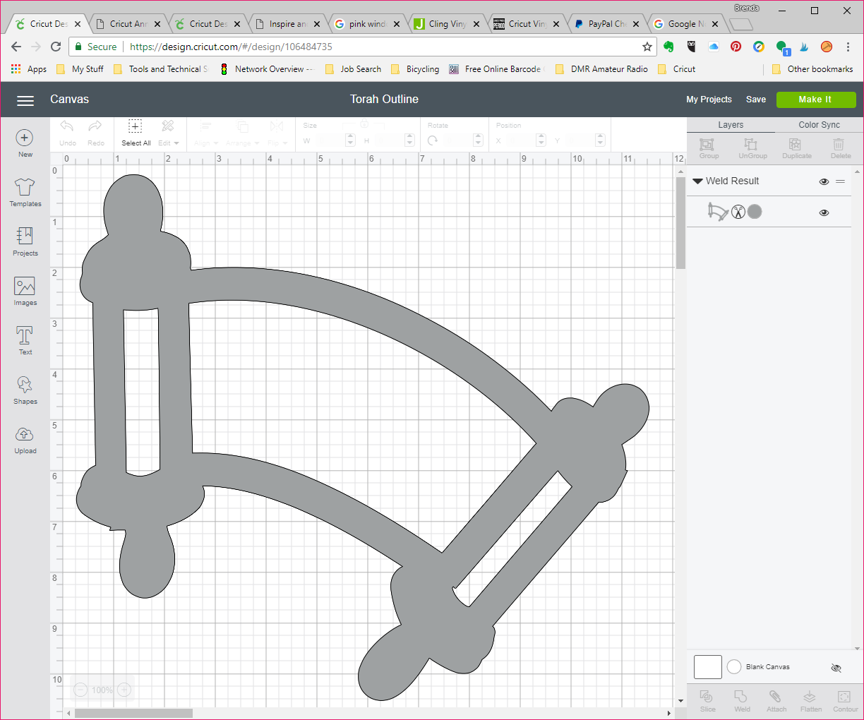
After organizing my layers, I ran a test cut in paper:

While the separated disks and sides of the scroll ends are nice in theory, I forgot to duplicate, slice, and dice the top handles, so there are two paper pieces where there should only have been one.
I fixed up the handles and set the three scroll surfaces to two different shades of brown.

A second, flatter version, welds those pieces into a single piece suitable for iron-on, though in a more cartoonish fashion. I would have loved to have been able to weld the open text and scrolls into a single piece for that version, but every time I tried, the refuses-to-fill center portion caused the entire shape to disappear. I left the text out of this one; it's just the template.

Another method I tried is a bit more stylized, using thick lines instead of different colors of heat-transfer vinyl. This style would be nicely visible, but leaves very little room for lettering.
I'm currently working on a T-shirt design for a sandek, the equivalent of an infant boy's godfather. I'll gather a few basic designs into a portfolio to prove I can create them, and customize from there as needed.
No comments:
Post a Comment