Showing posts with label Cricut Design Space. Show all posts

Monday, June 15, 2020

MLK, X Heritage and Schiller's Ode to Joy

Because it's such a great set of sound bites, I suspect that many of us most remember Dr. Martin Luther King from his "I have a dream" speech — a speech in which he dreams that one day, "little black boys and black girls will be able to join hands with little white boys and white girls as sisters and brothers".

While it's an ideal that still bears repeating, Dr. King is not the first to have considered the idea. In 1808, Friedrich Schiller wrote the words that were transformed by Ludwig van Beethoven into the first-ever symphony that employed a chorus, his Ninth ("Ode to Joy"). Referring to some future Elysium, Schiller writes "Alle Menschen werden Brüder" — all men shall be brothers. Yitzhak Peretz further expands this in his Yiddish lyric, my first exposure to Beethoven's tune, starting out with the line "Alle mentschen zaynen brider — broyne, gele, schvartze, vaysse". Rather than hoping for brotherhood in some Utopic future, he affirmatively states that we are brothers, right now, regardless of the color of our skin ("brown, yellow, black, white"). Thinking of the rainbow of my multicultural neighborhood, our store's customers, and the general area in which I live, restricting Dr. King's dream to just two extremes of skin tone seems... constrictive.

I started creating a field of generic (featureless) faces of different skin tones and hair colors, and even a couple of "covered" faces to honor the Muslims in our local community...

Further, in today's times, when our sense of gender has expanded beyond the binary, I tried adding a few faces with hairstyles that could be either male or female.

Then, finally, I added in Schiller's and Peretz's words (Yiddish is traditionally written in a variant of the Hebrew alphabet).
In checking the correct German and Yiddish spellings, I learned that some time later in his life, Peretz and others looked at his words more sarcastically than literally — though my Yiddish teacher emphasized to our post-détente class their Jewish Socialist origins. Meanwhile, I spent much of late January with an "Ode to Joy" earworm.

A design with this variety of colors lends itself well to using up vinyl scraps for the faces' hairstyles and hijabs, using paper templates to help with placement. Conversely, it does require a somewhat neutral background so as not to clash with those colors. I set my template to light gray to better visualize my layout, and after playing around with a number of colors decided that would be the correct background for my design.

Having missed Black Heritage Month and Hispanic Heritage Month, I was going to put this design away for next year. But in light of today's Black Lives Matter protests, I'm not waiting. It's not just people whose names might be "Brown" or "Hightower" (stereotypically African-American surnames) that matter: it's people whose (stereotypical) names might be Sanchez, Diaz, Rodriguez, Marcos; Chang, Wang, Li; Singh, Patel, Choudry; Farouk, Mohammed, Abdullah; Redcloud, Silverbird... and even people whose last names might be MacDiarmaid, van Gerwen, Santelli, or Rosenberg...


Wednesday, May 27, 2020

Coronavirus Fatigue

I don't need to mention that life has turned upside-down for many of us this year. Social isolation (excuse me, social distancing), masking to "protect others" (at the expense of one's own health), and "sheltering in place" (again, at the expense of one's own health) have become by-words for all, and a new sort of social shaming has arisen...

Like many on the personal-liberty end of the spectrum, I've been of the belief that while the worst of the disease is serious, our sociopolitical reaction to it is overblown, and we're putting our individual and community economic health at risk. We've been using a "portmanteau" (a word made up of two other words combined) to describe the current sociopoliticaleconomic situation: a panicdemic.

Welcome to the PANICdemic
While we have been fortunate in that the government stimuli have afforded us (at least for the month my sister and I were furloughed by our retail jobs) more money than we were making working (which we had to give up to return to our jobs), we realize that $600/week is chicken feed for those making a "living wage" or better (middle class in New Jersey starts at about $100k annual gross income), and most small business owners are losing everything they own — including their homes and businesses — because of shut-down and shelter-in-place orders. In short, many are
I think this describes most of us during the panicdemic
The variety of patriotic "Red, White & Blue" t-shirts we're selling this year strike an extremely off note as our constitutionally-guaranteed freedoms have been trampled upon by state and local officials in the name of "flattening the curve", "stopping the spread", writing "small business" stimuli such that they can only benefit "essential" big-box stores and "too big to fail" retailers (i.e., Amazon and  Walmart). In short, we have become the
I think this describes us better at this point in time than the National Anthem
 Since moving into a "masks required by law" environment, I have found that face coverings restrict my air intake (I swear one of these days I'm likely to aspirate my mask and suffocate!) and, because I have to SHOUT to be heard as as ||whisper||, dampening the mask with those droplets we're supposed to be not spreading, attracting and holding those airborne viruses we're supposed to be avoiding. I'm not alone in my dislike of mandatory facial coverings (especially when outdoors, at home — even in the public spaces of the multi-family dwelling in which we live, or at a reasonable distance from others), and therefore, I propose a bit of a throwback to the Clinton era:
Thankfully, our LGBTQIA+ community can serve openly now

I have a few other "Don't Mask/Won't Tell" designs, but they haven't made it onto T-shirts yet.

On the bright side of things, my sister's hairdresser is expecting her first child any day now. I had wanted to make an Infusible Ink onesie for her amidst some of the other things my sister wants to give, but was falling shy on inspiration. Amongst all this lockdown-fatigue creativity, it finally hit me:

I hope the baby never has to remember the panicdemic, the social distancing, the mandatory masking (are babies fussing over not recognizing parents in facial coverings like they do when parents don/doff spectacles?), or the economic devastation these illnesses are causing, and that she lives — like Moses — to 120 (or as long as she wishes to and is able to!) in good physical and mental health.

Saturday, March 21, 2020

Delayering Iron-On Vinyl for Improved Wearability

Two major issues with multiple-single-color vinyl designs are that there is no method for registering the various colors so the cuts all line up, and that many images are built color-layer upon color-layer, resulting in a finished product that is thick, inflexible, and vulnerable to multiple failure modes (adhesive doesn't stick to blank; adhesive doesn't stick to adhesive; bulging layered area more prone to vinyl being melted during application, or being torn during wear...)

Cricut Design Space's Duplicate and Slice tools make it very easy to remove the underlayers from your design and create a finished product that is well-adhered, comfortable to wear, and long-lasting.

Here's how to do it.

I.

Select a design and bring it into your canvas. (You can either select something from Cricut Access and choose the "Customize" option, or select something from another source.) For this example, I'm using "Koala Hugging Heart" (#MA52A3F9) from Cricut's "A Land Down Under" collection.


As you will note from the Layers panel on the right, this image is composed of three overlapping images, with the inside ears and features cut out of both the middle red layer and upper gray layer. You will also notice that the three layers are grouped.
.

While this would create a great three-dimensional image on cardstock (using glue dots between the black and red layers, and dimensional dots between the red and gray layers), in vinyl this would  create two layers through much of the graphic, expanding to three layers over the koala itself. So, we are going to use the duplicate and slice functions to remove the underlayers.

II.

Select the image. 
From the Layers panel (or the Edit panel on a tablet or smartphone), select "Ungroup". 
This allows us to work each layer individually, or in groups of two for slicing.

III.

Select the red and black layers. (You can select multiple layers by holding down the <Shift> key on a computer, or long-pressing the second and subsequent layers on your tablet or phone.)

Select Slice from the bottom of the Layers menu (computer), or from the Actions menu (tablet or phone). 
This will give you three "slices": 
  • a red koala
  • an identical black koala, and 
  • a black set of koala ears-and-features.

IV.

From the Layers panel, select the black koala.  (It doesn't matter that the red koala is on top.)
Delete the black koala.

V.

Select the gray koala and the red koala.
To make sure they're aligned correctly, select "Align" from the menu bar (computer) or the Edit menu (tablet or phone), and select "Align left" and then "Align middle".
Select Slice from the bottom of the Layers menu (computer), or from the Actions menu (tablet or smartphone). 
Again, this will give you three "slices":
  • the original gray koala
  • an identical red koala
  • a red heart with cutouts for the koala's paws.

VI.

Select, then delete, the red koala.

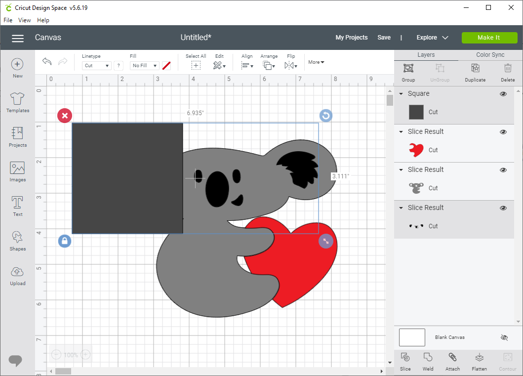
VII (optional).

If you want to save vinyl, you can separate the inside ears from the facial features as follows:
Select "Shapes" from the menu bar, then select "Square".
Position the square over one ear of the koala.

Select the square and the Slice Result containing the koala's features.
Select "Slice".
Select and delete the square.
Select and delete the extra koala inner ear.

Repeat for the second ear.

This will leave you with five layers instead of three. On the original 6.664" x 5" image, this will save about a 2" square of vinyl, about half of the black vinyl needed to cut the image already laid out. Vinyl savings will increase with a larger image size.

Color changed to yellow for visibility

VIII. 

Cut your image.
Remember to mirror iron-on vinyl (or conversely, don't mirror it and do a koala facing to the left). Weed all cut images.

IX. Applying vinyl

For the example image, iron on the koala first. Peel the carrier and keep it (we'll come back to it).
Position the facial features and inner ears. Place the carrier from the koala on top of the image before ironing on the eyes and inner ears.
Peel, retaining again the carrier from the koala.
Position the heart. Again cover the koala with its carrier before ironing on the last part of the image.

For a more complex image, you might want to make a copy of all the parts of the image, change it all to a single color, and cut out the copy in cardstock to use as a template.

Monday, September 16, 2019

New! Cricut Classes at Michaels (Watchung, NJ)

After way too much hemming and hawwing, I came up with an idea for a new Cricut class which was approved for teaching!

This Sunday (September 22) and again on Thursday, October 3, I will be teaching Make Math Fun With Cricut. Aimed at educators and parents, I'll show you how to use your Cricut Explore series or Maker to create tools to help explain everything from basic shapes through some of the fundamentals of geometry. (Well, sadly, not algebra.) If you're interested, you can sign up here.

For those of you who haven't unboxed your Cricut, been overwhelmed by DesignSpace, or are deciding which Cricut to buy, I will be running a Cricut 101 class on Sunday, October 13. The link to that class is here.

The classes are all afternoon sessions, with both Make Math Fun classes starting at noon, and Cricut 101 starting at 1PM. (The classroom folk decide what time to make the classes; the Math class really needs to be run as an evening session so teachers can attend.)


Friday, August 16, 2019

Thoughts on Mixing Iron-On Transfers, HTV, and Patterned HTV

For a recent set of t-shirt prototypes for my STARFLEET chapter, I needed a detailed print of a STAR TREK starship, STAR TREK-style lettering, and something to create a starfield background.

It was obvious at the start that I would need to use Print Then Cut on standard iron-on transfer sheets for the starship. I wanted to see if I could use "light" (see-through) iron-on transfer sheets on top of white Siser EasyWeed® Electric Heat Transfer Vinyl to create a metallic effect, or if I would need to use the solid-white iron-on transfer sheets meant for dark fabrics.

While the 6.5" x 9.25" bounding box Design Space requires for registration limits the size of my image, basic geometry tells me that if I angle the image to use the top corner of the box on one side, and the bottom on the other, I should be able to Print Then Cut an image greater than 9" in its long dimension. Unfortunately, no matter what orientation I set my starship, or what angle I saved and resaved it at in Photoshop, Design Space insisted on placing it on a vertical or horizontal axis and telling me it was too large for Print Then Cut. I ended up having to edit the orientation again in Mat View in order to print my images at something approaching my desired size.

Once I got my graphic in the correct size and orientation, I used a rotated version of it to create a "knockout" against a desired circular "star field" of either "Galaxy Black" Siser Glitter Heat Transfer Vinyl or Siser EasyPatterns® Heat Transfer Vinyl in "Infinite Galaxy" (that is to say, I delayered my text and images from my background).

Then I printed and cut the color-enhanced line-art starship from both dark-fabric and light-fabric iron-on transfers. I also cut the outline from "Pearl" (metallic white) Siser EasyWeed® Electric Heat Transfer Vinyl to place under the sheer "light fabric" transfer. I also cut the rest of my graphics (round "star field", chapter name, NCC number, "stardate" established, URL, and What 3 Words location)

Unlike most other heat transfer vinyls, Siser EasyPatterns® is cut from the "right" side of the vinyl, and is transferred to the surface to be ironed by a special vinyl transfer tape that is supposed not to be the same as the transfer tape used for adhesive vinyl.  I decided to try to use this transfer tape to position and iron on not just the EasyPatterns vinyl, but the dark fabric iron-on transfer as well.

The two prototypes I ended up with were purple (chapter's main color) with the "Infinite Galaxy" pattern for the star field and (if I recall correctly) the dark-fabric transfer for the starship, and navy (another "spacey" color) with "Galaxy Black" glitter for the star field, the white EasyWeed Electric and the light-fabric iron-on transfer for the starship. Both t-shirts used plain white for the lettering.

(Sadly, I didn't take pictures before I sold the one prototype and gave the other one to our chapter president to show off at an upcoming STAR TREK convention.)

It had been a while since I worked with iron-on heat transfers — since before I purchased my Cricut Explore Air and (more importantly) my Cricut EasyPress. Sadly, things didn't work out quite the way I wanted. The light-fabric transfer didn't want to transfer the image properly to the heat transfer vinyl, and the temperatures I needed to place all the pieces together caused the Siser EasyWeed® Electric Heat Transfer Vinyl to melt, and the iron-on transfers to melt a bit as well.

That said, a new design of chapter t-shirt is never an unwelcome thing, and it started us into a discussion of What 3 Words and its possible utility when colonizing an alien planet (hey, we're into STAR TREK, science fiction, and space exploration!)

Given the issues I had mixing the two types of iron-on, I finished the project knowing I'd need to do some more experimentation. Stay tuned for the next installment of "trying to get them to play nice together" <g>...

Friday, June 14, 2019

Mini Cupcakes Need Their Own Wrap!

One of my ongoing challenges with Design Space (and Cricut Access) has been that of creating cupcake wrappers with organizational logos. My issues have been mostly registration issues, where my logo would end up too high or too low, or the Explore Air would not "cut on the lines" of my cupcake wrappers.

Leading into this year's AVENGER anniversary party (I've been a member of the USS AVENGER chapter of STARFLEET, The International Star Trek® Fan Association since its inception, 34 years ago), I decided to tackle the cupcake wrapper issue again — this time using Print Then Cut to get my alignment just right.

Starting with the cupcake wrapper files I had saved in Adobe Illustrator, I moved my wrappers into a space that would fit into Print Then Cut's limitations (6.25" x 9"). I added my logos, then saved the file once as an .svg and once as a .jpg, and uploaded them to Design Space.


While Design Space understood the files, more or less, and could cut on my lines, I could not get it to not cut out the logo, regardless of how I uploaded the file, and regardless of whether I designated the design as Cut or as a Print Then Cut. (The only difference was whether it tried to cut just the outline, or every little color change.)


Finally, I tried something else. I created a second file identical to my logo-bearing file, but without the logo. I added a 4-point-stroke, no-fill rectangle around the wrappers so Design Space would know exactly where to cut.To prevent errant lines, I set the stroke of my wrapper outlines to None in both files. (The downloadable .ai file has hairline strokes so you can see where to place your logos.Select the wrapper outlines and set your stroke to None before printing.) I uploaded the second file as a Print Then Cut file, and loaded it onto my canvas (the project is available on my Cricut profile page). I printed the file from my original (logo-bearing) file, and when I went to Make the wrappers in Design Space, I clicked on the "I've already printed" link to skip printing out a blank rectangle.


I ended up with perfect cupcake wrappers — but I had a number of mini cupcakes, and they needed to be wrapped as well!

Try as I could, I could not find a premade design for mini-cupcake wrappers — so I did what any engineer would do: I ASSumed the two sizes of cupcakes had the same exact proportions, and based on a 3" top versus a 2" top, scaled everything down to two-thirds.


Yes, there's a reason it's spelled ASS-U-ME. When we went to wrap the mini cupcakes before icing them, we found the wrappers were over a quarter inch too tall, and didn't have enough curvature to hug the bottom of the cupcake liner. Well, so much for wowwing folk with the minis at the event — but afterwards, it was back to the drawing board.

The wrapper sticks out the bottom (too tall),
and there is excess space around the bottom of the mini-cupcake (not curved enough)

After a bunch of trial and error, I'm down to something that's about the right length and the right curvature, but if your mini cupcake has any sort of "muffin top", it's still about 1/8" too tall.

Original 2/3 size, interrim rework, final rework
(If it's just filled to the top of the tin, with a very little crown, the design works fine.)


The mini cupcake wrapper is available on my Cricut profile.

Thursday, April 25, 2019

Unicorn Party Hat

One of my colleagues is known for her collection of deely-boppers and headbands; she has at least one for every occasion, and is always collecting more.

While some of our customers suggest I should do likewise, that sort of head decor is not really my thing. My Kitschy Christmakwanzakah Fascinator (with full sets of felt Chanukah and Kwanzaa "candles") is about as far as I'm willing to go.

That said, a couple of weeks ago I was tapped to do another "Unicorn Fantasy" birthday party at Michaels. I had recently licensed a number of unicorn and unicorn-related images from DesignBundles.net, and decided that a party hat might be a cool thing to design. After a bit of browsing through the many images in the "Unicorn Bundle" I'd licensed, I decided on one of MStudio's designs from this group: a horn with a pair of horse ears and simple paper flowers. The original design also had eyelashes, but in order to make a headband, I needed to delete them from the image I'd be cutting.

A very large horn (left) before some better-scaled ones
Because I wanted my headband to have some dimensional layering, I had to reconstruct the underlayers from the original design so one could see the entire horn and flowers from both front and sides.

Backer piece, held onto the headband with paper tabs
On the fit side, I needed to add curvature so the design would sit on a human head and attach to a headband to hold it there. I also needed to create a backer for the design elements as well as the headband, and set everything to a reasonable scale. It took several tries to get it right.

I used Aleene's Quick Dry Tacky Glue and Studio G dimensional foam dots (similar to these) in the assembly process: first, manually gluing the horn bits to the back of the design, then the inside ears, then several layers of outside ears, and the top half of the tabs that secure the back to the headband.

(Note: I suggest using paper clips to clamp glued papers together until they dry.)

Side view shows holes for optional elastic.

Finally, the flowers went on with dimensional dots, and the design was ready to try out.


The design for this party hat is on my Design Space profile.

Tuesday, April 23, 2019

Business Card Holder Redux

After looking at the Business Card Holder design I published last month, I realized it would be an easy fix to make it slant backwards in the way we are used to seeing business cards presented. I also decided I didn't like the way the edge of the "holder" piece stuck out over the top, and the way the top corners of the "stand" piece were exposed.

In this edited design, the holder will stand slightly slanted, and the top of the "holder" is scored so that it can be glued across the top of the "stand".

I originally thought to suggest a pair of glue dots to secure the front part of the "holder" to the folded-to-front sides of the "front". As it turns out, Aleene's Fast Grab Tacky Glue is really good on this project, as long as you use paper clips to clamp the glued areas in place until they dry (about a minute or two).

Both of the above links should forward to my projects on Cricut Design Space.

The unicorn-theme paper design was tiled from Krystsina Kvilis (@peace-art)'s "Magical collection of unicorns II" from Design Bundles.net. (I had intended this particular holder for use at a unicorn-themed event.)

Front view (it got a bit crushed traveling)

Side view: slanted versus upright card holders

Oblique view, comparing the two designs

Wednesday, March 27, 2019

Cricut Project: Business Card Holder


This is the edited and completed version of the project I started at this year's Trenton Computer Festival (TCF). It is available on my Cricut Profile Page.

The instructions there are a bit terse, having to fit inside 500 characters. Here's a more complete version:

Supplies:

Preparation:

  • Print an allover design on cardstock (optional)
  • In Design Space, set all text to "not visible" (or just ignore the black mat)

Settings:

  1. Set your materials setting to "Poster Board" or "Poster Board +"
  2. If you have a Cricut Maker, use the Double Scoring Wheel.
  3. Cut "pretty side down" if appropriate (not what I did).
  4. Set your material size to 11" x 8.5" (letter)

Make the Project:

  1. Cut and weed both mats. You will have three pieces ("Stand", "Holder", and "Front")
  2. Take the "Stand" piece and fold all score lines to the back.
  3. Secure the top corners to the folded back top of the stand using Glue Dots.
  4. Hold the "Holder" piece so the three parallel score lines are towards the bottom. Fold the upper two score lines to the front; fold the lowest score line to the back.
  5. Use a tape runner on the plain side of the bottom of the holder to secure it to its adjacent section.
  6. Holding the "Front" with printed side facing you, fold all score lines to front at 90 degrees. 
  7. Turn the piece so you are looking at the unprinted side.
  8. Using a tape runner or Glue Dots, secure the "Holder" piece to the "Front", matching up the large rectangle and the folded-up ledge beneath it.
  9. Fold the side fronts over the "Holder", and use Glue Dots to secure the corner flaps to the bottom ledge. 
  10. Using Glue Dots, secure the two long tabs to the bottom ledge.
  11. Using the tape runner, Secure the front/holder piece to the "stand", matching large flat rectangles.

Finishing

Add business cards and set on table.

Note: if you prefer your cardholder to slant rather than stand upright, align the "Stand" with the top of the "Holder" rather than the bottom.

Tuesday, March 26, 2019

Cricut: Demonstration at Trenton Computer Festival

I spent Saturday at the Trenton Computer Festival (TCF), the longest-running amateur computer show in the United States. (Disclosure: I am Secretary of the Amateur Computer Group of New Jersey, one of the Festival's co-sponsoring organizations.) TCF prides itself as a place for the hobbyist to learn about new and interesting developments in the world of computing. We present a number of hobbyists and professionals speaking on a variety of computer- and computing-related topics, a Ham Radio licensing session, and an Arduino workshop.

This year, I went in with two goals: to present an introductory talk on home electronic cutters, and to display some of my T-shirt and other Cricut-fabricated designs at a vendor table in the hope of selling something (or at least getting some orders).

The talk went reasonably well, considering that for the first half of it I had to make do with downloading my PowerPoint presentation onto the school's computer and walking my iPad around the classroom so people could see how Design Space differs depending on the platform. (Note: the SlideShare version linked to above did not copy the Kelson Sans and Lato typefaces used by the PowerPoint template I chose, Kental NMNL from Creative Market.) After the talk ended, I carried my Cricut and computer back to the Vendor room to man my table.

Earlier that morning, I found that instead of having business-card display holders in my table supplies, I had only tri-fold brochure displays. I did have 100-lb cardstock and a variety of adhesives in my table supplies, and a month subscription to Cricut Access, so I searched its database for a business-card display holder.

You'd think that with over 70,000 images, box designs, and so on, and an audience that includes hundreds of small-business owners, there'd be something as basic as a business-card display holder. No such luck. Fortunately, it's something easy enough to jury-rig — and when complete, a design I could make public so other small-business owners can use at vendor tables of their own. (A more refined version, available over at my Cricut profile, is the subject of my next post.)


It took me a couple of tries to get something usable for on-site — which was fine for demonstrating the device, but not so fine for having my head far enough outside of my computer to engage the public as much as I'd have liked. That said, having my Cricut actually working was probably a better demo than just explaining it and showing folk my already-made samples.

There was more interest from people who thought I was selling Cricut machines or who wanted to know what the machine did, than people interested in buying my designs or having me design something for them. There were also a few folk who were looking for more information than I could present in a 40-minute deonstration, or whose family members had a Cricut (or other home cutter) and who wondered what the machine was and what it did.


Monday, March 25, 2019

Business Card Thoughts


Despite it being the age of bump-or-touch to transfer contact information, most of us still need, prefer, expect, or collect the paper précis of our professional identities and contact information in the form of 3.5" x 2" pieces of cardstock known as business cards or calling cards. As someone who crafts, instructs, is an officer of a local computer club, a long-standing member of an international fan association, and who has been active in the Diabetes Online Community, I have needed to carry several different versions of these cards, each of which requires a different professional or personal identity, and different subsets of my contact information.
Computer Club (current)
Blogger Card (Blog is still there, just inactive)

While most business-facing people never need to carry more than one version of their card at any time, those of us with social lives or "side hustles" cannot afford to be so narrow-minded.
Early version of our Web Warren cards
The speed with which our social lives change mean that for many of us, ordering 500 business cards through a service like VistaPrint means that 400 or more are likely to be obsolete before they get handed out. For us, home printing has been the service of choice for the past 20 years or so. We purchase 50-sheet (500-card) packages of microperforated paper from Staples, download the appropriate template from Avery (or create our own), add in our personal information, and press "Print".
Front of 2013 diabetes card
2014 card removes AOL Instant Messenger
That said, home printing for me entails a lot of waste. Some of that is because the margins on business cards are so narrow that a slight misregistration ends up with print trailing into the perforated margins (or worse, onto adjacent cards on the page), and some of that because I've had a number of two-sided designs that misfed or misregistered on the second side, rendering a sheet of paper... useless.
Back of 2013 diabetes card
2014 card removes defunct communities,
updates Tour de Cure information
Right now, we're at the stage of having to purchase a new pack of business card blanks. Unlike 20 years ago (or even 10!), the cost seems quite expensive compared to what I remember, and even compared to some of VistaPrint's higher-quality offerings. In comparison, cardstock is relatively cheap, and the flexibility of Design Space's "Print then Cut" feature made me wonder what Cricut's business-card potential might be.

(This is not to say that home electronic cutting machines would be the only way to create business cards from non-perforated cardstock: good manual paper cutters run half the price and serve admirably in a pinch. The problems are that the paper often shifts, and you don't have the sort of precision you can get from an electronic machine.)


For my latest Craft Instructor business cards, I wanted to work with the "Marble Glitter Business Card" template I'd gotten through an email subscription to Font Bundles/Design Bundles. I had some initial font issues in InDesign. After finding and installing the correct typeface and running a test print, the writing came out looking washed out, and the colors were too brownish. Since the original design was a Photoshop file, I opened it to edit. Photoshop CS4 only showed me one business card at the time. I tried Word, but it wasn't letting me layer text over the image frame. It was at this point that I imported the Photoshop-edited single-card graphic into Design Space.I resized the graphic to what seemed a reasonable size, not realizing it was meant as a full-bleed design, meant to be cut inside the decorative border. I ended up with six cards, approximately 3.6" wide by 2 1/6" tall — a bit larger than the standard 3.5" x 2" North American business card. I Attached the cards together to force Design Space to Print Then Cut a three by two grid of them on a single page of cardstock, rather than trying to make them all right-side up and spread over two pages.

I next tried to create a bordered card using one of the "Gold Digital Papers" designs from Design Bundles. I rescaled the paper from a 12" x 12" background to 1.25" and tiled it over a business card template in InDesign. I layered an opaque white rectangle in front, and my text box on top, and exported my single card to an importable .jpg file. After uploading my card to Design Space and resizing it a bit, I used the Square from Basic Shapes and elongated it into a 3.5" x 2" rectangle, centered it over the card, tweaked my card size, and Sliced the two layers it to create my business card. Setting these cards one next to the other which comes out to three rows of two cards, rotated sideways, plus one card in readable orientation. These printed out well, but my choice of typeface resulted in unreadably small text.


Finally, I used a background from a group called "Set of Marble Texture Cards" along with the "LD Laundry" typeface to create something a bit whimsical. I also used the Web Warren's short URL generator to create a custom link to my Design Space profile. Between this version and the gold-and-black design, I found that even Print Then Cut can end up with very small registration errors that can mar the final finish of your business card.

I reformatted my canvas with the Marble Texture card to allow for bleed. This reduced my yield per sheet of cardstock from 7 to 6. At a retail price of $16 per 100-sheet pack of 100-lb cardstock, this comes out to just under three cents per card for the cardstock. Compare this to $25 per 500-card (50-sheet) package of microperforated business card blanks, and you come out ahead, despite the larger volume of wasted-space on a page. Of course, if you're like me and buy on sale or with a coupon, your costs may be a bit less. Then again, the amount of time it takes to feed page after page of cardstock into the printer and then your cutter may make the costs of a service... worth it.

Update: check these posts for info on how to make a matching business card holder for a desk or display table:
Upright Business Card Holder
Slanted Business Card Holder