Using the content of free "trend" classes and projects at craft supply and manufacturers' web sites as a source of inspiration to take your crafts to the next level.
Disclaimer: I do not speak for any supplier, manufacturer, or community to which I link in my blogs. Because I was an employee of Michaels Stores until November 2021, many product links will lead to Michaels' product page rather than the manufacturer's.
Showing posts with label decorating t-shirts. Show all posts
Showing posts with label decorating t-shirts. Show all posts
Earlier this spring, I decided to look at all the secondary (economic, social, social-justice, and so on) issues caused by our politicians' and media's responses to CoV-SARS-2 (aka, COVID-19, the Novel Corona Virus, the 'Rona, etc.) as the modern equivalent of the Ten Plagues of the Biblical book of Exodus. My first design tried to put a bit of visual mnemonics: the "O" in the word "lockdown" looked like a keyhole, I had silhouettes of wild animals behind the line "wildlife incursions", and so on. I ended up with something looking a bit too much like the old "Ransom Note" aesthetic (or lack thereof!) of the early 1990s, so I started again from scratch. After playing around with a couple of different typefaces and moving the plagues around to avoid adjacent plagues of the same colors, I came up with something worth putting into vinyl:
While some of us might have chosen other plagues, or ways of expressing them, I had to keep in mind that my choices had to appeal to a broader, often progressive audience.
The seders themselves gave me more questions, some of which have brought me down an interesting rabbit-hole of published Biblical research. If I come to anything worth raising Ishmael, I'll probably write about it over on The Contrary Point of View.
Moving Towards Shavuot
Starting with the second night of Passover, Jews start a ritual called counting the Omer, referring to the seven-week period of the grain harvest. Conveniently, this period ends with the Biblical holiday of Shavuot (Pentecost) when, by tradition, the Law (the Ten Commandments and the start of the Oral Law that accompanies it) was received by the Tribes of Israel at Mount Sinai. The two-day harvest festival is relatively low-key for most Jews (stay home from work, add extra prayers, study Jewish Law, eat dairy foods), so it's not the sort of holiday that lends itself to a lot of holiday-specific decoration.
However, working at a craft store, and seeing religious designs that seem to focus on the Christian and the arguably-appropriated (dreamcatchers from Native American traditions, mandalas from Hinduism and Buddhism), along with designs that seem to align with Wicca and other European Earth traditions, I feel the need to create some balance with designs that celebrate Judaism.
Inspiration and Symbology
My original idea was to create a Mount Sinai with fire and smoke ascending or descending upon it, the traditional two tablets representing the Ten Commandments in the foreground, and 49 stalks of wheat, one for each day of the Omer. While this might have worked as a drawing or painting, it would have been way too busy for a t-shirt. I ended up with a rough outline of the peak of Mount Sinai, the two tablets (with the Commandments mnemonically reduced down to their numbers), and twelve stalks of wheat (one for each of the Twelve Tribes of Israel) divided into two groups of six, framing the Hebrew word "Shavuot". Those looking for a little more symbolism might recognize that the groups of six are further divided into two groups of three, with the two on the right side set up similarly to the Hebrew letter shin, the first letter in the Hebrew word for "Almighty".
original Shavuot Design, including background
I didn't want another white T-shirt — I wanted a bit of "natural" color — but I also wanted to use a blank I already had in stock. After examining my stash, I hovered between Bella+Canvas crew necks in Mauve and Dusty Blue, and started putting them together with vinyl colors. I settled on the mauve, using metallic, foil, and glitter accents to create texture in my final composition.
I'm planning to wear it at least once to work before the holiday, and again for a Zoom-based holiday celebration.
I don't need to mention that life has turned upside-down for many of us this year. Social isolation (excuse me, social distancing), masking to "protect others" (at the expense of one's own health), and "sheltering in place" (again, at the expense of one's own health) have become by-words for all, and a new sort of social shaming has arisen...
Like many on the personal-liberty end of the spectrum, I've been of the belief that while the worst of the disease is serious, our sociopolitical reaction to it is overblown, and we're putting our individual and community economic health at risk. We've been using a "portmanteau" (a word made up of two other words combined) to describe the current sociopoliticaleconomic situation: a panicdemic.
Welcome to the PANICdemic
While we have been fortunate in that the government stimuli have afforded us (at least for the month my sister and I were furloughed by our retail jobs) more money than we were making working (which we had to give up to return to our jobs), we realize that $600/week is chicken feed for those making a "living wage" or better (middle class in New Jersey starts at about $100k annual gross income), and most small business owners are losing everything they own — including their homes and businesses — because of shut-down and shelter-in-place orders. In short, many are
I think this describes most of us during the panicdemic
The variety of patriotic "Red, White & Blue" t-shirts we're selling this year strike an extremely off note as our constitutionally-guaranteed freedoms have been trampled upon by state and local officials in the name of "flattening the curve", "stopping the spread", writing "small business" stimuli such that they can only benefit "essential" big-box stores and "too big to fail" retailers (i.e., Amazon and Walmart). In short, we have become the
I think this describes us better at this point in time than the National Anthem
Since moving into a "masks required by law" environment, I have found that face coverings restrict my air intake (I swear one of these days I'm likely to aspirate my mask and suffocate!) and, because I have to SHOUT to be heard as as ||whisper||, dampening the mask with those droplets we're supposed to be not spreading, attracting and holding those airborne viruses we're supposed to be avoiding. I'm not alone in my dislike of mandatory facial coverings (especially when outdoors, at home — even in the public spaces of the multi-family dwelling in which we live, or at a reasonable distance from others), and therefore, I propose a bit of a throwback to the Clinton era:
Thankfully, our LGBTQIA+ community can serve openly now
I have a few other "Don't Mask/Won't Tell" designs, but they haven't made it onto T-shirts yet.
On the bright side of things, my sister's hairdresser is expecting her first child any day now. I had wanted to make an Infusible Ink onesie for her amidst some of the other things my sister wants to give, but was falling shy on inspiration. Amongst all this lockdown-fatigue creativity, it finally hit me:
I hope the baby never has to remember the panicdemic, the social distancing, the mandatory masking (are babies fussing over not recognizing parents in facial coverings like they do when parents don/doff spectacles?), or the economic devastation these illnesses are causing, and that she lives — like Moses — to 120 (or as long as she wishes to and is able to!) in good physical and mental health.
For a recent set of t-shirt prototypes for my STARFLEET chapter, I needed a detailed print of a STAR TREK starship, STAR TREK-style lettering, and something to create a starfield background.
It was obvious at the start that I would need to use Print Then Cut on standard iron-on transfer sheets for the starship. I wanted to see if I could use "light" (see-through) iron-on transfer sheets on top of white Siser EasyWeed® Electric Heat Transfer Vinyl to create a metallic effect, or if I would need to use the solid-white iron-on transfer sheets meant for dark fabrics.
While the 6.5" x 9.25" bounding box Design Space requires for registration limits the size of my image, basic geometry tells me that if I angle the image to use the top corner of the box on one side, and the bottom on the other, I should be able to Print Then Cut an image greater than 9" in its long dimension. Unfortunately, no matter what orientation I set my starship, or what angle I saved and resaved it at in Photoshop, Design Space insisted on placing it on a vertical or horizontal axis and telling me it was too large for Print Then Cut. I ended up having to edit the orientation again in Mat View in order to print my images at something approaching my desired size.
Once I got my graphic in the correct size and orientation, I used a rotated version of it to create a "knockout" against a desired circular "star field" of either "Galaxy Black" Siser Glitter Heat Transfer Vinyl or Siser EasyPatterns® Heat Transfer Vinyl in "Infinite Galaxy" (that is to say, I delayered my text and images from my background).
Then I printed and cut the color-enhanced line-art starship from both dark-fabric and light-fabric iron-on transfers. I also cut the outline from "Pearl" (metallic white) Siser EasyWeed® Electric Heat Transfer Vinyl to place under the sheer "light fabric" transfer. I also cut the rest of my graphics (round "star field", chapter name, NCC number, "stardate" established, URL, and What 3 Words location)
Unlike most other heat transfer vinyls, Siser EasyPatterns® is cut from the "right" side of the vinyl, and is transferred to the surface to be ironed by a special vinyl transfer tape that is supposed not to be the same as the transfer tape used for adhesive vinyl. I decided to try to use this transfer tape to position and iron on not just the EasyPatterns vinyl, but the dark fabric iron-on transfer as well.
The two prototypes I ended up with were purple (chapter's main color) with the "Infinite Galaxy" pattern for the star field and (if I recall correctly) the dark-fabric transfer for the starship, and navy (another "spacey" color) with "Galaxy Black" glitter for the star field, the white EasyWeed Electric and the light-fabric iron-on transfer for the starship. Both t-shirts used plain white for the lettering.
(Sadly, I didn't take pictures before I sold the one prototype and gave the other one to our chapter president to show off at an upcoming STAR TREK convention.)
It had been a while since I worked with iron-on heat transfers — since before I purchased my Cricut Explore Air and (more importantly) my Cricut EasyPress. Sadly, things didn't work out quite the way I wanted. The light-fabric transfer didn't want to transfer the image properly to the heat transfer vinyl, and the temperatures I needed to place all the pieces together caused the Siser EasyWeed® Electric Heat Transfer Vinyl to melt, and the iron-on transfers to melt a bit as well.
That said, a new design of chapter t-shirt is never an unwelcome thing, and it started us into a discussion of What 3 Words and its possible utility when colonizing an alien planet (hey, we're into STAR TREK, science fiction, and space exploration!)
Given the issues I had mixing the two types of iron-on, I finished the project knowing I'd need to do some more experimentation. Stay tuned for the next installment of "trying to get them to play nice together" <g>...
A snippet of a Purim song — all that I think my Dad remembered — floated through my mind this past week as we approached the Jewish festival of Purim. While the religious cause of the celebration is the Jews' escape from the genocide proposed by the Persian vizier, Haman (as described in the book of Esther), the celebrations are loud, drunken, and often in costume — to the point where it's best described as "the Jewish Mardi Gras".
The marquee food of this festival is Hamantaschen — a triangular shaped cookie or pastry, traditionally filled with poppy seed paste or prune butter, though modern filling variations range from fruit preserves (usually raspberry or apricot) to chocolate, peanut butter, or even pastry cream. Depending on which story you hear, the name refers to Haman's hat, his ear, or his pocket/money pouch. At any rate, when we eat them — just as we shout, stamp, and wave noisemakers (graggers) during the public reading of Esther — we are obliterating the name of the story's villain.
Purim T-Shirt with cardstock positioning template
I Googled the snippet I remembered, only to find that I had learned the first part of the snippet incorrectly, that the lyrics came from a 1940s-era pedagogue, and that the familiar children's melody came from a drinking song often heard at Renaissance faires. (The pertinent results here.)
Of course, I would bake Hamantaschen (how could I not?)... but I also had an idea for a fun Purim T-shirt. (Hey, I'm a bit old to pass for Queen Esther or Queen Vashti, and nobody dresses up as Haman's wife!) I was able to use the basic shapes in Design Space to create a bitten-into Hamantaschen and some scattered crumbs, along with Cookie Monster's patented "nomnomnomnomnom" for my design.
Shirt next to real homemade Hamantaschen
While a shift at work meant I was not going to get drunk enough to not know the difference between "Blessed is Mordechai" and "Cursed is Haman", I have another shirt design to share (my Design Space profile here).
The first Friday of February has been, for the past decade or more, a day to wear red to remember Women's Heart Health. It's important because women's cardiac symptoms are often very different from men's, and tend to be ignored — yet heart disease and heart-health-related causes are the most common cause of death among women.
It's been a bit of a dilemma for me to wear red since the Diabetes Online Community started the practice of wearing blue on Fridays for Diabetes Awareness, and I've been living with type 2 diabetes for the past seventeen years. (The irony is even greater when one considers that living with any type of diabetes raises one's risks for heart disease and heart-related death, and that the diabetes that caused the heart-related death is often ignored in the post-mortem.)
Some years, I'll honor both by wearing a blue base layer with a red short-sleeved shirt. This year, I decided to use bleach, dye, and my Cricut to create a blue-edged T-shirt with both Go Red and World Diabetes Day (WDD) logos.
My original idea was to have the blue circles ringing around the sleeves, half into the blue-dyed areas; I was debating whether to go with a heart, a red dress, or the American Diabetes Association's "Stop Diabetes!" hand on the body...
I started with two Gildan crew-neck t-shirts — one in Heather Red and one in Antique Cherry Red. The Heather Red bleached to a very pale pink, enough to pass for white.
The Antique Cherry Red, based on black and magenta, didn't do as well. The black parts turned out to be permanent to bleach, leaving me with something closer to a Sport Gray.
There is a risk to trying multiple methods of color removal on a single fabric, and that is that each treatment weakens the fabric to the point of tearing or disintegration. (Note: bleaching animal fibers — wool, silk, alpaca, etc. — will dissolve the fabric. While bleach can weaken linen and cotton, they are generally safe to bleach.) Nevertheless, I tried Rit Color Remover on the gray sections. It didn't do anything to the color. Nor did a couple of patch tests of ordinary household peroxide...
After the color removal process, I dip-dyed the hem and sleeve edges of both T-shirts in concentrated fabric dye and let them set for a day before washing out the excess. Unfortunately I missed on the color and the blue was a bit too red to do the rings of blue circles, so I had to settle for putting single circles on a white flag (per the World Diabetes Day logo use requirements). I also wanted to do things quickly, so I settled on the Go Red dress cut out from a white heart. I cut these from my Cricut and prepared to iron them on.
It was at this point that my concerns regarding the color removal process came to light. While pre-pressing, I found a couple of small holes in the blue-dyed portions of the Antique Cherry Red shirt. OK, I figured, I might just have to wear the shirt tucked in...
The holes only got worse as I ironed on my designs. I did wear that shirt for my morning shift at work, but it was largely covered up by an overlayer. Taking it off, I ripped a couple new holes in the sleeve.
Aside from the vinyl heart being too large and too low, the rest of the T-shirt designs came out OK. I wore the Heather Red shirt later that day, and along with presenting my usual Red Dress Cookies, it was a great Wear Red day.
One of the downsides of large T-shirt designs such as "Hippopotamus for Christmas" and "Dreidel for Dummies" is the amount of heat-transfer vinyl (iron-on, HTV) that they use. Not counting the costs for licensing Cricut Access images, the hippo T would have cost me $30 in materials; the dreidel T, $20, had I not been working at Michaels and been able to use Associate discounts on top of sale prices. I'm not counting design time or application time, and I've saved a significant amount of vinyl on the hippo by delayering the images. This would put the retail price of a vinyl T somewhere in the $30-40 range, even for a $2-on-sale craft T-shirt. (The blanks Cricut associates use on their instruction videos run $10-15 on sale at places like Target and Old Navy, making a more "designer" look that much more expensive!)
My colleague S. would have loved a hippo T, but the materials costs alone would be out of budget for her. I found a cute Snowman T-shirt pattern on Design Space that could be made cheaply from scrap vinyl — with a few tweaks to the pattern.
When I looked at the mats, I noticed all the little black dots for the snowman's eyes and mouth were attached, as well as the white dots for the reflections in the snowman's eyes. That ends up creating a lot of wasted vinyl. I also noticed that there was no way to register the cut so one knew exactly where to place the orange nose.
Since Design Space doesn't have a good way of setting registration marks, I decided to create a paper template.
First, I attached all of the design elements into a single cut image and resized it to an appropriate size for the T-shirt. Attaching elements turns them all the same color, but it's easy enough to turn them back later.)
I used this monochrome to cut my paper template. Instead of weeding the background, I weeded out the design elements to produce a template with openings for each of my vinyl cuts. While the weeding isn't perfect, it's sufficient for my purpose.
Next, I detached all of the design elements and returned them to their proper colors. I also delayered the inner eye, so I would only have one layer of vinyl throughout the shirt.
You'll notice these use a lot less vinyl if cut from a fresh roll. Each piece can be moved individually, so they can be positioned to use waste vinyl, either manually (in the Web app) or by using the Snap Mat feature on an iPad. I used scrap vinyl from "Dreidel for Dummies" and "Baby, It's Cold Outside" for my white and black, and the rest of a "row" of rolled vinyl for my orange.
My final cost: about $6, if I include the vinyl as rolling inches.
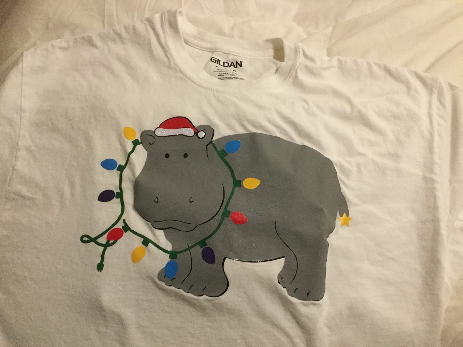
Last year, the overwhelming "stop playing this, already" Christmas song was Elvis's "Blue Christmas", leading me to do a pair of multiprocess blue T-shirts including the ghosts of Elvis, and on one version, (Bob) Marley's ghost. ("The obligatory Dickensian reference.") This year, I must have heard "I Want a Hippopotamus for Christmas" a dozen times between Thanksgiving Day and the following Monday. So when my sister decided she needed some new Christmas T's for a competition at work, hippos were still on our mind...
Since I'm not much of an artist, I searched Cricut Access for images of hippos. To make the friendly-looking beast (Cricut Access image M2E803) Christmas-y, I added a Santa Hat (Cricut Access image M188702D) and a string of lights (Cricut Access image M8AE3A8A) to the composition. Having all the elements I needed, I had to combine them into an image that made sense.
I removed the grayscale hat, moved the red hat and changed its angle to sit on my hippo's head. Then I had to see about moving the lights so it looked like they were being worn as a necklace. Fortunately, the hippo image is a group of layers, some of which include a separate head.
I ungrouped the hippo and moved the two head-only images in front of the lights. I then turned on the narrower of the black underlayers so we could see the hippo's black eyes.
It was about this point that I ran my first paper prototype and found that the slices that give form to the hippo's legs, toes, nostrils, ears, and mouth are just single cuts which would disappear in an iron-on. At that point I hid everything but the hippopotamus, screen-captured my Design Space screen, brought it up in Paint, thickened the lines in question, and saved it out as an image to import back into Design Space. I used the original image and the Slice function to separate the better-defined hippo into head and body sections.
The other thing I realized is that half the lights are digging into the hippo's neck. I used squares, the Slice function and the Weld function to turn the light sockets around so
they all faced out, and rotated the lights as necessary.
At this point, the folk at Cricut would have you think the design was ready to go...
Not so fast!
With all of the layers involved, the finished T-shirt would be very thick and inflexible. I needed to turn off everything I didn't need in the finished shirt, and once I cut everything, trim things back to minimize the amount of layering needed. (That meant cutting the head off the black version of the entire hippo, because it was only duplicating the black head that would lay over the string of lights.) I also detached all of the lights so they would use a lot less vinyl; I could position them by hand.
After weeding, I placed everything in layers in some semblance of registration so I knew which layers had to go on the shirt in what order. I printed out a screenshot of my Design Space design so I knew how it all had to go together. Then I took it all to work so I could use our classroom's Easy Press to put everything together.
The typical Chanukah version of the "Ugly Christmas Sweater" includes a chanukiah (9-branched menorah), a Star of David, and/or a dreidel (4-sided top with Hebrew letters on each side). It is some combination of a near royal blue and white, echoing the colors of the Israeli flag (which in turn, echo the colors of a traditional tallith or prayer shawl, which themselves echo the Biblical command to wear a garment with fringes, and in each corner, a thread of a particular shade of blue — Num. XV:37-41). Gold, silver, or their equivalent tones of yellow and gray, may be added for contrast.
While the game of dreidel is quite simple, it seems difficult to explain to someone for the first time. This is particularly true because the letters on the dreidel are generally written in Hebrew "print", and to a non-Hebrew reader, the nun (נ) can look very similar to the gimmel (ג). I decided to have some fun and print up a T-shirt with an irreverent set of instructions, and presented in the manner of Wiley Publishing's "For Dummies" series of books and e-books. I licensed a couple of dreidel images from Cricut (#M3BA72 and #M87F31EA), and because I didn't have the same typefaces as Wiley uses for their series (and hey, I didn't want to copy their cover page design exactly because that would be copyright infringement!), I used dafont's Kanisah Regular (for the word "Dreidel") and the installed version of Papyrus ("for Dummies") on the back, Google Fonts' Alegreya Sans Italic for the title on the front, and Arial Bold for the instructions themselves.
It was a fun project and basic enough to "share" on Design Space. Little did I know that Provo Crafts' blog authors thought it worthy of highlighting!
I was looking for Judaic-themed shirts recently, just to see what was around and get some ideas for what sells at what price points, and one of the links Google found was my "Dreidel for Dummies" in Cricut's "Holiday T-Shirt" blog.
I wish I'd found out about it earlier, but hey! Thanks, Cricut!
The other day, I got an idea for a T-shirt for Simchat Torah, the holiday that celebrates our rejoicing over finishing the annual public reading of the Torah and the beginning of the next year's cycle. I wanted to start with a black or navy T-shirt and a bleach resist process to create a bit of a glow around the image of a Torah, with the word "B'reishith" ("In the beginning") in the center, and a flared star behind the last letter (Taf). The idea was to echo the concept of separating the light from the darkness, the First Day.
As the design formed in my mind, it echoed the words of two religions:
In the beginning, [The Name] created the heaven and the earth. [Gen. I:1]
In the beginning, there was the Word, and the Word was G-d... [Luke I:1]
Having had some questions about bleeding with a paper resist, and wanting an effect that would be produced by bleaching onto a damp shirt, I chose to use a reverse stencil to set up a wax resist for batik. My original plan for the stencil was to cut a piece of plastic poster board, which I've found to be an excellent and inexpensive stencil base. (Note: it does need to be cut down to fit through a Cricut or other home cutter.) My first cut, set at "stencil vinyl", didn't penetrate the plastic. My second, set for "Stencil Vinyl" (pressure 171), didn't penetrate completely. I tried cutting again set at "Stencil Film - 0.4 mm" (pressure 341), but forgot to reposition my cut, so I ended up ruining the stencil material for this particular use and had to use Cricut Stencil Vinyl instead.
[Aside: I was completely underwhelmed by Cricut Stencil Vinyl. It had an adhesive back, which meant the stencil stuck to itself as I tried to remove it from the backer film, and it was so thin that my stencil tore in several places. It didn't easily lend to using both the original and the reverse stencil, and it doesn't lend easily to stencil reuse.]
After much materials wrangling, I finally positioned my stencil in place and waxed my resist area. Removing the stencil was another chore, as my wax was harder than the stencil material and I would still need the stencil for the final splatter paint.
I dampened the shirt and started spritzing bleach. I probably should have bleached first and watered later, since the glow area wasn't as bleached as I would have liked, and extended much further than I would have liked.
After bleaching and wax removal
After washing to remove the remainder of the beeswax, I applied various splotches of fabric dye and water bleeds to bring the bleached area back to about where I wanted it. Overdyeing didn't help as much as I would have liked, but it did add a lovely layer of complexity to the shirt.
After overdyeing
Next, my lettering. After a bit of hemming and hawing, I chose silver foil (to mimic the "dressings" we have on many real-life torahs) for the letters and a silvery holographic vinyl for the "star". Choosing Shlomo STAM for my typeface was a no-brainer, since I wanted to echo the formality and divinity of the Sefer Torah. Unfortunately the holographic vinyl didn't show up as well as I wanted, and neither vinyl wanted to adhere well at the fussy, tiny points.
I finished up the shirt by reapplying the stencil to the entire torah area and splattering the shirt with silver Liquitex acrylic ink and silver Ph. Martin pen ink to create th effect of stars in the firmament surrounding the Book of Creation, separating the Earth from the Heavens...
Completed T-shirt
"B'reishith" is a one-off, an "artist t-shirt". But I'd like to take another go at trying to simplify the process of something a bit closer to my original vision.
After talking with an Observant Jewish friend, I got the idea for a design I felt might be a bit more appropriate for a Bar Mitzvah t-shirt.
Design Sketch
Jewish men tend to have strong memories of the parshah (weekly Torah and Haftorah (Prophets) readings) they were required to learn for the public synagogue performance that defines most modern B'nai Mitzvah (Bar Mitzvahs). The readings are tied to specific weeks of the Jewish calendar. I came up with the graphic idea of a Torah scroll, open for reading, with the Bar (or Bat) Mitzvah's Jewish name, along with the parshah and date (intended to be written in Hebrew). I used "David ben Avraham" as a generic male name, and since my Hebrew and Jewish learning isn't that great and I wasn't at home when sketching, I chose the parshah "Vayyera" as one whose name I remembered, sketching it in English to be customized in Hebrew for any particular Bar Mitzvah.
Once I got home, I used a couple of brush markers to ink the outlines of the scroll, imported it into my graphics programs, and uploaded it into Design Space.
Note that the lines have been thickened, and the rollers colored in a single (flat) brown to make them easier to cut and weed. (I have since added a white underlayer for the parchment.)
Following the method I outlined in my previous post, I added my sample Bar Mitzvah boy's name and the words "Bar Mitzvah" in Photoshop and curved the text appropriately:
Vertical Text Typing Reversal
The problem came when I started trying to insert the vertical text in Photoshop: because I forgot to check the "switch orientation" icon, the letters were jumbled together, and when I started separating them by putting each on a separate line, they disappeared... and then they appeared, in reverse order. Even when I copied my text into vertical orientation, they were in reverse order... until I typed in my text into Character Map as it normally read.
So, if you are looking to include vertical text in a right-to-left language, you will need to remember to not reverse the order of your letters, with a notable exception:
"Ki Tetze"
I changed my sample parshah from "Vayyera" to "Ki Tetze" (כִּי־תֵצֵא) when I started blocking out my text. My main reason for this was a shorter name. That said, it's two words, and the last letter (yad) of the first word doesn't go all the way down to the baseline.
Because I was having trouble getting vertical text in Photoshop, I selected a system font with Hebrew characters and copied my text into Design Space. At first, the typeface I'd originally chosen didn't show up in my system fonts there, but that was because I'd forgotten to refresh the tab to refresh my system fonts index.
Regardless of whether I entered text in Photoshop, Illustrator, or Design Space, I had to play around with line spacing to get the letters to appear as cohesive words, and with the size of my text box to make sure all those letters appeared in the text object. That said, the vertical orientation — and what I could do with it — varied from program to program.
Slanted Text
Because Design Space keeps each text block as a separately editable, but not warpable, object, rotating the text was sufficient to get it to align with the torah scroll. That said, the amount of difference in line spaces, along with the common use of the character yad as a vowel, required me to put "Ki" (kaf-yad) on a single line, with "Tetze" following as a separate vertically-aligned word.
Both Photoshop and Illustrator have better line spacing, however, keeping my letters as text causes them to handle text rotation differently from Design Space, as well as differently from each other.
Since Design Space treats each text object as a single, image-like object, using the rotation handle to rotate my vertical text ends up perfectly aligned to my slanted rolled parchment, even though each letter is on a separate line. If I place each letter on a separate line in Illustrator, rotating my object will cause my letters remain upright, but indent each line to follow the object's slant.
Both Illustrator and Photoshop have text-orientation toggles that let you type normally, but format your letters vertically. In CS4, which is the (admittedly-ancient) version of Creative Suite I'm working with, the toggle is under the "Type" menu in Illustrator. In Photoshop, with the text tool selected, it's a small "T" with vertical and horizontal arrows that appears just to the left of the typeface selector on the text ribbon. That said, I had to rasterize my vertical text in Photoshop — making it ineditable — before I could rotate it.
Finding New Faces
Being that I'm looking at doing some more artistic work with Hebrew text, I looked for and installed several dozen different free Hebrew typefaces I found at sources such as WebToolHub, FontSpace, Free Hebrew Font, AlefAlefAlef and the Open Siddur Project. I was looking primarily for a couple of faces in Hebrew "script", of which I had none in my collection, as well as some variations in display fonts that would make for interesting (and potentially marketable) items.
These showed up nicely in Photoshop and Illustrator as expected, but didn't show up in Design Space until I saved my project and reloaded the tab.
Dates?
I'm sufficiently unfamiliar with the system of using Hebrew letters for numbers that it's going to take some more work before I'm able to complete the left-hand scroll with a reasonable sample Hebrew date.
Working at Michaels, I've seen a lot of T-shirts, hats, and sashes that say "Bride", "Bridesmaid", "Team Bride", and so on. I've also seen a lot of Bar and Bat Mitzvah favors that say something like
David's Bar Mitzvah
3-16-18
Regency Hotel
Mazel Tov!
That's fun if you're Reform, Conservative, or have many non-Jewish friends and family attending. But what about my friends and customers who are more "Observant" — a heading which includes Orthodox, Modern Orthodox, Chassidic, and/or Haredi — customers who, if they wear T-shirts (and some of them might) would prefer to have that done up in Hebrew lettering? What about modern versions of the aprons my mother and grandmother wore growing up, embroidered in Hebrew with the words "Yom Tov" (holiday) or "Shabbat" (Sabbath), or the towels and potholders labeled "Milchig" (dairy) or "Fleischig" (meat) in the local Judaica shop?
Wouldn't it be fun to do those up on the Cricut?
And that's just Hebrew. How about my Muslim customers, my Russian customers, my Asian customers... people who speak and observe their religions in languages not served by the Western alphabet?
It's possible, but it may take a bit of a workaround.
Since my linguistic vocabulary is limited to a few Hebrew and Yiddish (which uses a variation of the Hebrew alef-bet) words and phrases, my examples will be taken from those languages.
Getting the Right Fonts
On the plus side, Windows (and I presume Mac OS) operating systems include access to the full Unicode character set for many typefaces, which means (in theory) I could use Character Map to bring up my characters, copy them, and paste them into Illustrator, Photoshop, or Design Space. Unfortunately, my current version of Windows and my old version of Adobe Creative Suite don't always talk the same typeface language (Open Text versus the older PostScript and TrueType), so it's a bit hit-and-miss as to what's available where, and whether or not the font designer added in a Hebrew character set.
At least for Hebrew, a quick way of learning if the typeface supports it is to load a blank document into Word or Photoshop, select a text area (or text tool), and look at your font dropdown menu. In Word, the typeface's primary alternate character set will be on the right, in the direction that language is usually read. In Photoshop, typefaces with code pages for Chinese, Japanese, Korean, Arabic, and Hebrew alphabets will show up organized into sections below the main list of typefaces, with a few characters from each to show how the typeface looks in that codepage.
A more thorough (but tedious) way to check if any individual typeface has a particular character set is to go into Windows' built-in Character Map, select your font, and scroll down through the code pages. While your primary language can be directly entered from the keyboard, your alternate-alphabet language may have to be loaded by searching for your character by Windows' name for it, or by scrolling down to your desired character and double-clicking.
Windows Paint, Photoshop Workarounds
If I try to upload a text file into Design Space, it'll get rejected — and I can't save a Windows document to an image format Design Space supports. But outside of Illustrator, Photoshop, and Design Space, there's no good way to turn text into images, except by screen capture. For me, the easiest way to save a screencap is to paste it into Windows Paint, crop out the extraneous information, and save it. (I could use Photoshop, but for something that quick and simple, I don't need Photoshop's long load time and large system overhead.)
Because I'd been having font issues in Illustrator, I did some basic composition in Word, capturing my screen and pasting it into Windows Paint, cropping down to my text, saving in .png format, and importing into Design Space.
Example: "Sandek" (one of the godfathers (usually the grandfathers) at a brit-millah). Typeface: Frank Ruehl.
Layers and Effects
I hoped I'd be able to get around some of those codepage issues once I added Hebrew and Yiddish languages into Windows, but there are still things I can't do directly. As an example, I can get a very even large outline around a letter in Illustrator by duplicating the letter, adding a heavy stroke to the duplicate, and placing it behind the original letter. Unfortunately, saving the file in .svg causes Design Space to lose the stroke information, and I get two identical copies of the same letters.
Example: "Kallah" (bride). Original design as created in Illustrator. Typeface: Rod Regular.
Example: "Kallah". How Design Space interprets the .svg file
I found two ways to get the correct layering. The first was to export each layer individually as a .png file, import them into Design Space as cut-only images, load them both onto my design mat, resize them and align them to line up correctly.
Correctly aligned layers in Design Space
The second way was to export my design to Photoshop, color the bottom layer text the same as the stroke color, and save each layer separately in .jpg format.
Typing Text Directly
It's not impossible to use non-Western fonts directly in Design Space, but I will note an issue with non-left-to-right codepages: when I've selected Hebrew as my system language, Design Space (as well as Photoshop and Illustrator) will render Hebrew correctly right-to-left, but in order to have a legible, legitimate word, I have to type in my characters left to right.
"Kallah" rendered as typed in Design Space. Typeface: David Regular
As you can see, my text is entered correctly from right to left, but the characters are rendered left to right. For Hebrew, Yiddish, Arabic, or other right-to-left words to appear correct, I need to enter them in reverse order.
"Kallah" properly rendered, typed in reverse order.
Some Final Notes...
Being unfamiliar with the usual way of entering "pointed" characters, I had to use Character Map and scroll down to the very bottom of the code page to find the Kaf with the dagesh — the dot in the middle — that differentiates it from a Khaf.
Because one of the things I was looking for going into this exercise was images for Rosh Hashanah, I found what appears to be a good source for Jewish, Muslim, and other religious and ethnic graphics. The images are not free, but they're reasonably priced, and the site doesn't require a paid subscription to look at the packages.
The fun font for "David's Bar Mitzvah" is "Bungee Shade" from Google Fonts, which is a collection of typefaces Google publishes for Web use.
One of the things I've learned really quickly about my Cricut is it can create a lot of wasted vinyl and specialty cardstock. While I've been pretty lucky about getting my initial materials on sale, that's still a dollar or more per 12" x 12" sheet of material, with a lot of leftovers from the small projects I've been working on.
One option for using these leftovers is to cut your printed vinyl close to edges of your design before weeding, and use the leftover unprinted vinyl for another project. This is fairly simple if your designs are all small and relatively linear, like the geocaching reference number for The Other Half's car, or the starship profile I ironed on my multiple-process mixed-media T-shirt.
It's a bit less simple if you've printed out a corner flourish for your desk or notebook.
In the former case, you can fill a sheet with multiple copies of your artwork (if you need them). As an example, I can print my computer club's logo two-across on a 12" vinyl sheet, and then cut off the remaining nine inches for another project.
As long as your vinyl sheet has a ninety-degree corner (more or less) to align to the top and left sides of the mat, and it covers the area of the mat that will be printed, you're good to go.
If your vinyl scrap is more rounded, you may need an iPad or an iPhone and the Snap Mat feature of Cricut's DesignSpace app. (Note: there's a beta version of DesignSpace for Android, but it doesn't have Snap Mat.) The way it works is, you lay your vinyl (or other material) on the mat, take a picture of the mat through the app, and use the Move handles to move your pieces to where your vinyl is on the mat. The process is a bit slow and tricky at first, but as long as your Cricut registers your mat properly, you've got a great way to save material.
But what if your piece has one or more large interior spaces, the type which can't be cut (except maybe carefully, with a blade on a self-healing mat), and/or which is better weeded? Isn't there anything you can do with that?
Of course there is... at least, I think there is. Here are some of my hypotheses and tests:
Background: ready-to-cut eat transfer vinyl consists of two (or sometimes three) layers: the clear carrier layer, the effects layer (in holographic and reflective HTVs), and the adhesive layer.
Because the carrier is already resistant to melting at iron-on temperatures, can it be used as a protective layer for other iron-ons (such as layered HTV or typical inkjet t-shirt transfers)?
So far, it seems to work OK for regular HTV. I've used it to iron hand-cut reflective hearts onto an old pair of cycling shorts to improve my night visibility.
I haven't tried it yet with iron-on fabric or inkjet t-shirt transfers.
After weeding, the exposed part of the carrier is tacky — tacky enough to grab weed scraps from either your iron-on project or your adhesive vinyl project. Can these be used as carriers to use the weeded vinyl?
If I have a large piece of HTV that has been weeded. Is the adhesive bond strong enough to reuse the carrier and have my Cricut cut the scrap vinyl?
So far, I've only tried it with the carrier from glitter vinyl.
It worked (relatively) fine for a scrap of reflective iron-on, which is almost as thin as foil HTV. The big issues were that the scraps could stretch out of plane (so they wouldn't lie flat on the carrier), and that it was difficult to keep bubbles from forming
After re-cutting
After re-cutting - close-up
It didn't work as well for the scrap of glitter HTV, largely because the HTV didn't want to adhere well to the used carrier.
Can I reuse the carrier as transfer tape for adhesive vinyl?
Sadly, the answer for this appears to be "no". The HTV carrier is thicker and less flexible than the regular adhesive vinyl and its transfer tape. Even after burnishing, my Oracal 651 and Cricut Premium Vinyl both wanted to stay adhered to the carrier rather than my project. (Sorry, no pics for this one)
Similar questions exist for regular (sticky-back) adhesive vinyl and its backing. As long as the weeded scrap stays in plane and has enough stick to adhere to the used backing, the Cricut should work just fine.
Of course, if you're going to try to reuse non-heat-transfer-vinyl in this way, you will need to make sure you keep the adhesive as pristine as possible, and the carrier must be free from lint and scraps as well.
I hope this helps some of you electronic-cutter folk get some more mileage from your materials.
On Friday, July 27, Michaels stores across the country demonstrated the Cricut EasyPress for the nation's teachers.
As a home sewer and occasional iron-on-t-shirt maker, the EasyPress has been an interesting product to watch — although not necessarily one I really need. That said, our in-house guide said that the demonstrator should be an expert at the EasyPress so she can answer teachers' questions. So, I took a few hours the day before the event to familiarize myself with the EasyPress machine and its accessory EasyPress mat.
I came prepared with pre-cut designs for a couple of T-shirts, using several different types of Cricut and Siser heat transfer vinyls (aka "iron-ons") as well as a fabric iron-on and some fabric to which I'd previously applied HeatnBond® Ultrahold, my stocks of HeatnBond® Lite and HeatnBond® UltraHold, a few T-shirts, a baseball cap, my tailor's ham, my Quilter's Cut 'n Press and some scraps of polyester and linen, as well as a few rolls of various types of HTV (heat transfer vinyl) and scraps from my cuttings and weedings.
EasyPress Versus the Iron
My iron is still from the days where there's a dial setting that goes Low (Acrylic/Silk/Nylon), Medium Low (Polyester), Medium (Wool), Medium High (Cotton), and High (Linen), with steam options not kicking in until you get at least up to Medium heat. I've done enough burn tests on scraps to know what burnt silk, polyester, wool, cotton, and linen look like and smell like. That said, I didn't know how the EasyPress's maximum setting of 360° compares until I looked it up just now. [Update: on July 30, Cricut announced the Easy Press 2, which will debut Fall 2018. It will come in three sizes and heat up to 400°.]I do know that some customers have returned the EasyPress because it doesn't get hot enough for their needs — which is why I brought along both cotton and linen samples, which generally require the highest heat to press.
The EasyPress has a square sole plate with rounded corners, rather than the somewhat shoe-shaped standard household iron. As a presser, it has no vents — which means it heats more evenly (no more steam-hole marks in your ironing). Its larger area means it can potentially press larger, flat pieces of fabric more rapidly than an iron. It comes with a sample project: a glitter iron-on teacup and a 4" x 4" piece of canvas fabric.
The EasyPress is heavier than a regular iron, but that should mean you can just set it down on your iron-on. It seems to do OK that way for basic ironing, but it still left shadow creases in my cotton and linen samples. That's probably because linen and cotton usually require steam pressing, but the EasyPress is designed around keeping one's work as moisture-free as possible.
The size and weight of the EasyPress make it difficult to maneuver around curved pieces; the logo I tried to iron on a hat never managed to "take" correctly, and I ended pulling it off.
While the EasyPress might be useful for sheer cafe curtains, I wouldn't chuck my home iron for it.
The EasyPress Mat
The 12" x 12" EasyPress Mat we were given is just a little bit larger than the EasyPress, enough to lay out the design area of an average meant-to-be-tucked-in adult t-shirt, and about the same size as my 12" x 12" Cut 'n Press. (Both 8" x 10" and 16" x 20" EasyPress mats are also available.) Continuing with the "as dry as possible" meme, the mat includes a heat-reflecting inner layer as well as a moisture wicking layer. The mat is flexible and could be rolled if needed.
Placed on a hard table, the EasyPress Mat is about as stiff as a padded ironing board, and not nearly as stiff as the padded side of the Cut 'n Press. The fluffiness of the mat is one reason most iron-ons require the user to press down on the EasyPress.
Setting Up the EasyPress
The EasyPress comes with a quick reference card of settings for the time and temperature needed to adhere different types of iron-on to different types of fabrics and non-fabric surfaces; a more complete chart is available on the website. No matter where you set it last, the EasyPress turns on to a default setting of 250F with a 30-second timer. You press the temperature or time button and the up-and-down arrows to set your temperature between 150 and 360F, and your time between 1 and 300 seconds (5 minutes). The device has a safety timer which will shut it down after 10 minutes of non-use.
While the charts suggest temperatures as low as 185F for delicate fabrics such as silk, and times as low as 10-15 seconds, the average iron-on appears to require 30 seconds at 340F — and as it turns out, the higher temperature didn't seem to harm either my polyester sample or vinyl-on-vinyl layering.
Testing
As noted earlier, my iron-on fabric did not adhere well to my baseball cap. It was fine on one of my t-shirts, though. I'm pretty sure the hat's curvature had a lot to do with that.
My other tests were: reflective HTV on canvas (took a lot of time) and on a t-shirt, regular and metallic HTV on a t-shirt; two varieties of HeatnBond on cotton, welded onto black linen; scraps of regular, metallic, and glitter HTV on linen, and regular HTV on polyester. No matter the heat setting or the amount of time, nothing seemed to burn, char, or do something else. That said, if I forgot to press the countdown button, or wait for the press to come up to temperature, and accidentally laid the press down on a sample, it held fast to the linen fabric when I removed the iron two or three seconds later and the Siser and Cricut carriers even peeled nicely!
Thoughts
The EasyPress is a fun and easy way to add "iron-ons" to T-shirts, towels, and any surface that can be kept flat and wrinkle free. It's $149.99 price is comparable to a high-end iron, but you don't get the options of steam, spray, vertical steam, and/or cordless operation that those irons provide (and its cord does get in the way), so it's more of a companion tool than a replacement for your trusty household iron. That said, if you do a lot of iron-on, the amount of time it will save you might be well worth the price.
While I work for Michaels, my thoughts on the EasyPress are my own.