Showing posts with label Design Space. Show all posts

Tuesday, August 20, 2019

Iron-On Heat Transfers and Smokey Bear

We're of that ilk of people for whom teddy bears are "real" (think: "Velveteen Rabbit" real), and so when we read that Smokey Bear was coming to town to celebrate his 75th birthday, and that there was geocaching involved, our geo-trackable teddy bears got all excited and wanted to do something to celebrate.

They've also been after me for t-shirts for the warm weather. (Donovan usually wears a hand-knit Christmas sweater after Thanksgiving, and a hand-knit Irish Fisherman Sweater most of the rest of the winter, while Lambie wears a hand-knit Maple Leaf sweater, celebrating his Canadian heritage (we found him at a gift shop in Halifax, Nova Scotia. Donovan started life as a Boyd's Bear with a renfaire mission, traveling with us from Renaissance Faire to Renaissance Faire, usually dressed in 1570s-era Spanish Court attire.)

The first Smokey 75th graphic I saw, attached to the Mid-Atlantic Forest Fire Compact's commemorative Smokey Bear GeoTour passport, was set against a night forest sky. A nice rectangle for something that would look like a "band" t-shirt, and since spokesbears like Smokey are the equivalent of rockstars to the teddy bear world, highly appropriate.


Not wanting to sew an entire pair of t-shirts from scratch, I found Lambie would reasonably fit the top half of a newborn-size onesie. I still would need to sew Donovan's shirt from scratch. Since I was using white fabric, I sized and printed the GeoTour logo on light-fabric iron-on. I also double checked my heat settings: the 400F cotton setting suggested for iron-on was hotter than my original Cricut EasyPress goes, so it was off to the regular iron. (Besides, these shirts were really too small for a heat press.)

Sadly, even with the higher temperature, the transfer looked incomplete and extremely washed out.


Additionally, Donovan's shirt was a bit tight, the neckline a bit feminine, and the sleeves too long.

Donovan (left) and Lambie in their original Smokey Bear T-shirts

So I recut Donovan's shirt, reprinted the graphics on dark-fabric iron-on, and went from there. Meanwhile, my sister's trackable bear Mink (and his sidekick Del Sol) needed to garb out as well. Mink is tiny enough that the best I could do for him was a singlet with a version of the official Smokey Bear 75th birthday logo. Del Sol, even smaller, could only manage a superhero-style cape. And so the bears were now ready to party with Smokey Bear.

The bears explore the photo props at Smokey's birthday party
Once we decided that we were going to celebrate Smokey's birthday at Liberty State Park, it occurred to me that we should get the people in the household involved in the t-shirt project, just like those families who do Disney parks in matching t-shirts. For this, we chose the official logo (following the proper logo guidelines) for the upper left corner of our shirts, with the geocachers' names on the back along with #SBGT for "Smokey Bear GeoTour". As a non cacher, I refer to myself as a "geo tag-along" and put that on the back of my shirt.


The official color Smokey 75 logo is meant to be produced only on a white or khaki background; all other color backgrounds require a single color white or black logo (logo guidelines here). Since the bears were going to be wearing white, we would wear white also, making it easy to use the color logo.

You may recall from a previous post that iron-on transfers require the "cotton" temperature setting, which is hotter than my original EasyPress will go; I therefore used a regular iron. I tested one of my spare light-color transfers using the iron's cotton setting, and found that even with the high heat setting and pressure, the transfers looked washed-out on a white T. While the white background of dark-fabric iron-on transfers would not necessarily show up on a white shirt, I find that the more superfluous iron-on kept in the transfer, the less flexible the stretchy t-shirt is, and the more like an "iron-on heat transfer t-shirt" it appears. (This is one issue I had with early CafĂ© Press products...)

Of course, I have a Cricut — which means I can use Print then Cut to perfectly (or near perfectly) trim the transfer! On the other hand, the Smokey 75 logo typeface has a distressed look with a lot of open spaces, and the logo itself has some open spaces as well. The third issue is trying to figure out the correct settings for cutting iron-on transfers.

Since there are two methods of uploading a complex graphic to Design Space, I found the key was to upload the image twice: once as the Print then Cut file I wanted to produce, and once as an outline Cut file. In both cases, I removed the white background. For simplicity's sake, I chose to not worry about cutting out the centers of my letters (which I would have needed to do if I were printing the logo for a khaki shirt).

Print then Cut, and Cut only, uploads

To prevent the program from cutting out all those micro-holes, I sized Cricut's basic shapes (mostly rectangles) to match the widths of my distressed letters, and welded them to the Cut-only graphic. After welding out all the tiny distressing holes, I aligned my cut image with my color image, moved my color image to the top, changed my Cut only image to white, and flattened the two layers. This gave me a color image with simplified cutouts (you can see the white that remains where the "5" meets the birthday balloon).

I changed my Design Space background to blue so you can see the effect:


While my images were small enough to fit two to a page, Design Space didn't want to set them up to cut that way. As a result, I needed to duplicate my logo, put the two copies side by side, and Attach them to save iron-on material. Unfortunately, this ended up with some stray cuts through my image. (Fortunately, nothing that couldn't be faked through with the appropriate use of HTV transfer tape... but I'm getting ahead of myself.)

Notice the centers of the "B", "R", "D", and "A" have not been weeded. A white circle behind Smokey was needed to avoid Design Space adding a cut line across the bottom of Smokey's face. The balloon string separated from the carrier paper and is curled up in the upper right of the image.
As you can see from my printed, cut, and weeded sample, my image has a number of separate elements which must be aligned correctly to produce the copyrighted image. As an image printed on opaque medium, the adhesive side is attached to the carrier sheet. I needed some sort of transfer tape to keep my elements aligned for heat transfer. Fortunately, I had purchased a yard of the stuff from Ante Up Graphics, from whom I purchased my "Infinite Galaxy" Siser EasyPatterns® back in June. It's called "Siser TTD High Tack Mask", and it's used pretty much the same way transfer tape is used for adhesive vinyl projects.

Using the TTD High Tack Mask is not without its own issues. Like the carrier for normal HTV, the material is not as impervious to heat-press temperatures as I'd like it to be: it warped for almost every project I've tried it on, occasionally releasing an improperly-adhered (or non-adhered) design element, and iron-on ink sticks to it and comes off on the next project.

In the end, all of our Smokey Bear 75 garb was a hit, and the three people had as much fun as the four teddy bears did geocaching and chasing down Smokey for pictures.

Smaller 75 logo on Lambie's sleeve

Donovan and Lambie look for a geocache
More Geocaching

The bears meet Sparky the Fire Dog

Me, Smokey, and the Teddy Bears


Friday, August 16, 2019

Thoughts on Mixing Iron-On Transfers, HTV, and Patterned HTV

For a recent set of t-shirt prototypes for my STARFLEET chapter, I needed a detailed print of a STAR TREK starship, STAR TREK-style lettering, and something to create a starfield background.

It was obvious at the start that I would need to use Print Then Cut on standard iron-on transfer sheets for the starship. I wanted to see if I could use "light" (see-through) iron-on transfer sheets on top of white Siser EasyWeed® Electric Heat Transfer Vinyl to create a metallic effect, or if I would need to use the solid-white iron-on transfer sheets meant for dark fabrics.

While the 6.5" x 9.25" bounding box Design Space requires for registration limits the size of my image, basic geometry tells me that if I angle the image to use the top corner of the box on one side, and the bottom on the other, I should be able to Print Then Cut an image greater than 9" in its long dimension. Unfortunately, no matter what orientation I set my starship, or what angle I saved and resaved it at in Photoshop, Design Space insisted on placing it on a vertical or horizontal axis and telling me it was too large for Print Then Cut. I ended up having to edit the orientation again in Mat View in order to print my images at something approaching my desired size.

Once I got my graphic in the correct size and orientation, I used a rotated version of it to create a "knockout" against a desired circular "star field" of either "Galaxy Black" Siser Glitter Heat Transfer Vinyl or Siser EasyPatterns® Heat Transfer Vinyl in "Infinite Galaxy" (that is to say, I delayered my text and images from my background).

Then I printed and cut the color-enhanced line-art starship from both dark-fabric and light-fabric iron-on transfers. I also cut the outline from "Pearl" (metallic white) Siser EasyWeed® Electric Heat Transfer Vinyl to place under the sheer "light fabric" transfer. I also cut the rest of my graphics (round "star field", chapter name, NCC number, "stardate" established, URL, and What 3 Words location)

Unlike most other heat transfer vinyls, Siser EasyPatterns® is cut from the "right" side of the vinyl, and is transferred to the surface to be ironed by a special vinyl transfer tape that is supposed not to be the same as the transfer tape used for adhesive vinyl.  I decided to try to use this transfer tape to position and iron on not just the EasyPatterns vinyl, but the dark fabric iron-on transfer as well.

The two prototypes I ended up with were purple (chapter's main color) with the "Infinite Galaxy" pattern for the star field and (if I recall correctly) the dark-fabric transfer for the starship, and navy (another "spacey" color) with "Galaxy Black" glitter for the star field, the white EasyWeed Electric and the light-fabric iron-on transfer for the starship. Both t-shirts used plain white for the lettering.

(Sadly, I didn't take pictures before I sold the one prototype and gave the other one to our chapter president to show off at an upcoming STAR TREK convention.)

It had been a while since I worked with iron-on heat transfers — since before I purchased my Cricut Explore Air and (more importantly) my Cricut EasyPress. Sadly, things didn't work out quite the way I wanted. The light-fabric transfer didn't want to transfer the image properly to the heat transfer vinyl, and the temperatures I needed to place all the pieces together caused the Siser EasyWeed® Electric Heat Transfer Vinyl to melt, and the iron-on transfers to melt a bit as well.

That said, a new design of chapter t-shirt is never an unwelcome thing, and it started us into a discussion of What 3 Words and its possible utility when colonizing an alien planet (hey, we're into STAR TREK, science fiction, and space exploration!)

Given the issues I had mixing the two types of iron-on, I finished the project knowing I'd need to do some more experimentation. Stay tuned for the next installment of "trying to get them to play nice together" <g>...

Wednesday, March 27, 2019

Cricut Project: Business Card Holder


This is the edited and completed version of the project I started at this year's Trenton Computer Festival (TCF). It is available on my Cricut Profile Page.

The instructions there are a bit terse, having to fit inside 500 characters. Here's a more complete version:

Supplies:

Preparation:

  • Print an allover design on cardstock (optional)
  • In Design Space, set all text to "not visible" (or just ignore the black mat)

Settings:

  1. Set your materials setting to "Poster Board" or "Poster Board +"
  2. If you have a Cricut Maker, use the Double Scoring Wheel.
  3. Cut "pretty side down" if appropriate (not what I did).
  4. Set your material size to 11" x 8.5" (letter)

Make the Project:

  1. Cut and weed both mats. You will have three pieces ("Stand", "Holder", and "Front")
  2. Take the "Stand" piece and fold all score lines to the back.
  3. Secure the top corners to the folded back top of the stand using Glue Dots.
  4. Hold the "Holder" piece so the three parallel score lines are towards the bottom. Fold the upper two score lines to the front; fold the lowest score line to the back.
  5. Use a tape runner on the plain side of the bottom of the holder to secure it to its adjacent section.
  6. Holding the "Front" with printed side facing you, fold all score lines to front at 90 degrees. 
  7. Turn the piece so you are looking at the unprinted side.
  8. Using a tape runner or Glue Dots, secure the "Holder" piece to the "Front", matching up the large rectangle and the folded-up ledge beneath it.
  9. Fold the side fronts over the "Holder", and use Glue Dots to secure the corner flaps to the bottom ledge. 
  10. Using Glue Dots, secure the two long tabs to the bottom ledge.
  11. Using the tape runner, Secure the front/holder piece to the "stand", matching large flat rectangles.

Finishing

Add business cards and set on table.

Note: if you prefer your cardholder to slant rather than stand upright, align the "Stand" with the top of the "Holder" rather than the bottom.

Monday, March 25, 2019

Business Card Thoughts


Despite it being the age of bump-or-touch to transfer contact information, most of us still need, prefer, expect, or collect the paper prĂ©cis of our professional identities and contact information in the form of 3.5" x 2" pieces of cardstock known as business cards or calling cards. As someone who crafts, instructs, is an officer of a local computer club, a long-standing member of an international fan association, and who has been active in the Diabetes Online Community, I have needed to carry several different versions of these cards, each of which requires a different professional or personal identity, and different subsets of my contact information.
Computer Club (current)
Blogger Card (Blog is still there, just inactive)

While most business-facing people never need to carry more than one version of their card at any time, those of us with social lives or "side hustles" cannot afford to be so narrow-minded.
Early version of our Web Warren cards
The speed with which our social lives change mean that for many of us, ordering 500 business cards through a service like VistaPrint means that 400 or more are likely to be obsolete before they get handed out. For us, home printing has been the service of choice for the past 20 years or so. We purchase 50-sheet (500-card) packages of microperforated paper from Staples, download the appropriate template from Avery (or create our own), add in our personal information, and press "Print".
Front of 2013 diabetes card
2014 card removes AOL Instant Messenger
That said, home printing for me entails a lot of waste. Some of that is because the margins on business cards are so narrow that a slight misregistration ends up with print trailing into the perforated margins (or worse, onto adjacent cards on the page), and some of that because I've had a number of two-sided designs that misfed or misregistered on the second side, rendering a sheet of paper... useless.
Back of 2013 diabetes card
2014 card removes defunct communities,
updates Tour de Cure information
Right now, we're at the stage of having to purchase a new pack of business card blanks. Unlike 20 years ago (or even 10!), the cost seems quite expensive compared to what I remember, and even compared to some of VistaPrint's higher-quality offerings. In comparison, cardstock is relatively cheap, and the flexibility of Design Space's "Print then Cut" feature made me wonder what Cricut's business-card potential might be.

(This is not to say that home electronic cutting machines would be the only way to create business cards from non-perforated cardstock: good manual paper cutters run half the price and serve admirably in a pinch. The problems are that the paper often shifts, and you don't have the sort of precision you can get from an electronic machine.)


For my latest Craft Instructor business cards, I wanted to work with the "Marble Glitter Business Card" template I'd gotten through an email subscription to Font Bundles/Design Bundles. I had some initial font issues in InDesign. After finding and installing the correct typeface and running a test print, the writing came out looking washed out, and the colors were too brownish. Since the original design was a Photoshop file, I opened it to edit. Photoshop CS4 only showed me one business card at the time. I tried Word, but it wasn't letting me layer text over the image frame. It was at this point that I imported the Photoshop-edited single-card graphic into Design Space.I resized the graphic to what seemed a reasonable size, not realizing it was meant as a full-bleed design, meant to be cut inside the decorative border. I ended up with six cards, approximately 3.6" wide by 2 1/6" tall — a bit larger than the standard 3.5" x 2" North American business card. I Attached the cards together to force Design Space to Print Then Cut a three by two grid of them on a single page of cardstock, rather than trying to make them all right-side up and spread over two pages.

I next tried to create a bordered card using one of the "Gold Digital Papers" designs from Design Bundles. I rescaled the paper from a 12" x 12" background to 1.25" and tiled it over a business card template in InDesign. I layered an opaque white rectangle in front, and my text box on top, and exported my single card to an importable .jpg file. After uploading my card to Design Space and resizing it a bit, I used the Square from Basic Shapes and elongated it into a 3.5" x 2" rectangle, centered it over the card, tweaked my card size, and Sliced the two layers it to create my business card. Setting these cards one next to the other which comes out to three rows of two cards, rotated sideways, plus one card in readable orientation. These printed out well, but my choice of typeface resulted in unreadably small text.


Finally, I used a background from a group called "Set of Marble Texture Cards" along with the "LD Laundry" typeface to create something a bit whimsical. I also used the Web Warren's short URL generator to create a custom link to my Design Space profile. Between this version and the gold-and-black design, I found that even Print Then Cut can end up with very small registration errors that can mar the final finish of your business card.

I reformatted my canvas with the Marble Texture card to allow for bleed. This reduced my yield per sheet of cardstock from 7 to 6. At a retail price of $16 per 100-sheet pack of 100-lb cardstock, this comes out to just under three cents per card for the cardstock. Compare this to $25 per 500-card (50-sheet) package of microperforated business card blanks, and you come out ahead, despite the larger volume of wasted-space on a page. Of course, if you're like me and buy on sale or with a coupon, your costs may be a bit less. Then again, the amount of time it takes to feed page after page of cardstock into the printer and then your cutter may make the costs of a service... worth it.

Update: check these posts for info on how to make a matching business card holder for a desk or display table:
Upright Business Card Holder
Slanted Business Card Holder

Wednesday, January 9, 2019

Working With Vinyl Scraps

One of the downsides of large T-shirt designs such as "Hippopotamus for Christmas" and "Dreidel for Dummies" is the amount of heat-transfer vinyl (iron-on, HTV) that they use. Not counting the costs for licensing Cricut Access images, the hippo T would have cost me $30 in materials; the dreidel T, $20, had I not been working at Michaels and been able to use Associate discounts on top of sale prices. I'm not counting design time or application time, and I've saved a significant amount of vinyl on the hippo by delayering the images. This would put the retail price of a vinyl T somewhere in the $30-40 range, even for a $2-on-sale craft T-shirt. (The blanks Cricut associates use on their instruction videos run $10-15 on sale at places like Target and Old Navy, making a more "designer" look that much more expensive!)

My colleague S. would have loved a hippo T, but the materials costs alone would be out of budget for her. I found a cute Snowman T-shirt pattern on Design Space that could be made cheaply from scrap vinyl — with a few tweaks to the pattern.

When I looked at the mats, I noticed all the little black dots for the snowman's eyes and mouth were attached, as well as the white dots for the reflections in the snowman's eyes. That ends up creating a lot of wasted vinyl. I also noticed that there was no way to register the cut so one knew exactly where to place the orange nose.


Since Design Space doesn't have a good way of setting registration marks, I decided to create a paper template.

First, I attached all of the design elements into a single cut image and resized it to an appropriate size for the T-shirt. Attaching elements turns them all the same color, but it's easy enough to turn them back later.)


I used this monochrome to cut my paper template. Instead of weeding the background, I weeded out the design elements to produce a template with openings for each of my vinyl cuts. While the weeding isn't perfect, it's sufficient for my purpose.


Next, I detached all of the design elements and returned them to their proper colors. I also delayered the inner eye, so I would only have one layer of vinyl throughout the shirt.


You'll notice these use a lot less vinyl if cut from a fresh roll. Each piece can be moved individually, so they can be positioned to use waste vinyl, either manually (in the Web app) or by using the Snap Mat feature on an iPad. I used scrap vinyl from "Dreidel for Dummies" and "Baby, It's Cold Outside" for my white and black, and the rest of a "row" of rolled vinyl for my orange.


My final cost: about $6, if I include the vinyl as rolling inches.

Needless to say, S. was surprised and delighted.

Tuesday, January 8, 2019

I Want a Hippopotamus for Christmas

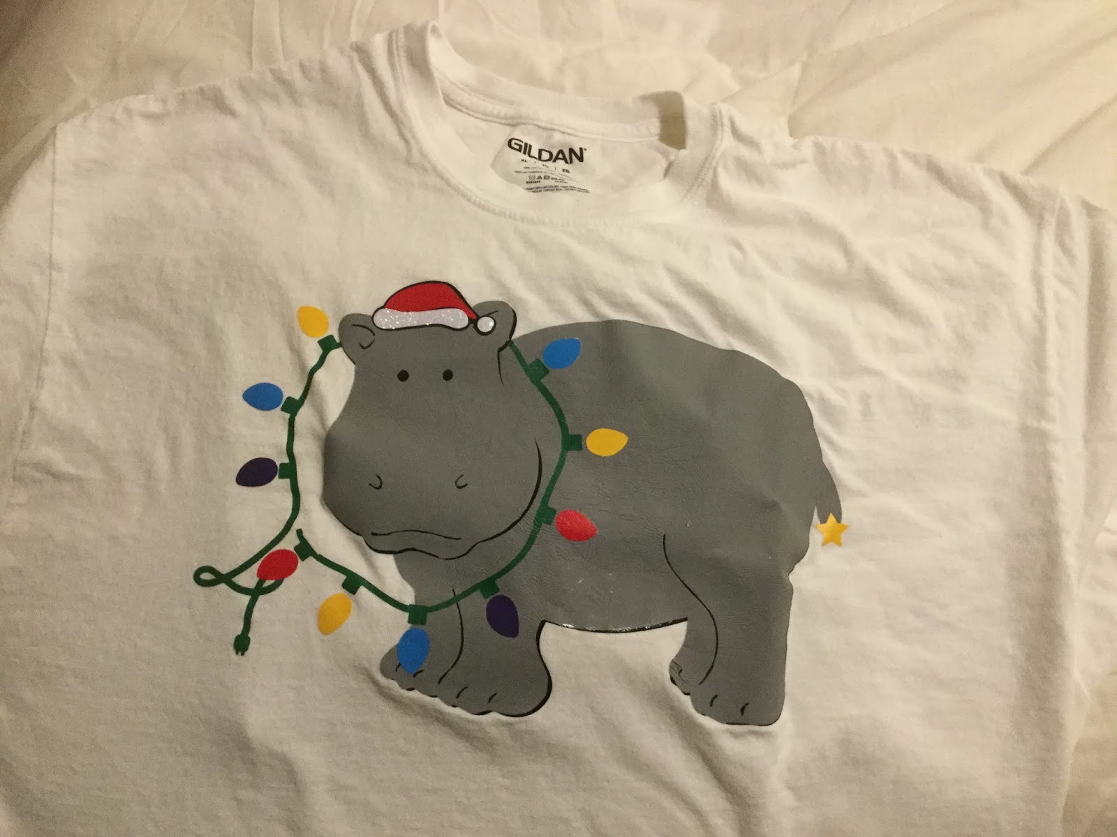
Last year, the overwhelming "stop playing this, already" Christmas song was Elvis's "Blue Christmas", leading me to do a pair of multiprocess blue T-shirts including the ghosts of Elvis, and on one version, (Bob) Marley's ghost. ("The obligatory Dickensian reference.") This year, I must have heard "I Want a Hippopotamus for Christmas" a dozen times between Thanksgiving Day and the following Monday. So when my sister decided she needed some new Christmas T's for a competition at work, hippos were still on our mind...

Since I'm not much of an artist, I searched Cricut Access for images of hippos. To make the friendly-looking beast (Cricut Access image M2E803Christmas-y, I added a Santa Hat (Cricut Access image M188702D) and a string of lights (Cricut Access image M8AE3A8A) to the composition. Having all the elements I needed, I had to combine them into an image that made sense.

I removed the grayscale hat, moved the red hat and changed its angle to sit on my hippo's head. Then I had to see about moving the lights so it looked like they were being worn as a necklace. Fortunately, the hippo image is a group of layers, some of which include a separate head.


I ungrouped the hippo and moved the two head-only images in front of the lights. I then turned on the narrower of the black underlayers so we could see the hippo's black eyes.


It was about this point that I ran my first paper prototype and found that the slices that give form to the hippo's legs, toes, nostrils, ears, and mouth are just single cuts which would disappear in an iron-on. At that point I hid everything but the hippopotamus, screen-captured my Design Space screen, brought it up in Paint, thickened the lines in question, and saved it out as an image to import back into Design Space. I used the original image and the Slice function to separate the better-defined hippo into head and body sections.

The other thing I realized is that half the lights are digging into the hippo's neck. I used squares, the Slice function and the Weld function to turn the light sockets around so
they all faced out, and rotated the lights as necessary.


At this point, the folk at Cricut would have you think the design was ready to go...

Not so fast!

With all of the layers involved, the finished T-shirt would be very thick and inflexible. I needed to turn off everything I didn't need in the finished shirt, and once I cut everything, trim things back to minimize the amount of layering needed. (That meant cutting the head off the black version of the entire hippo, because it was only duplicating the black head that would lay over the string of lights.) I also detached all of the lights so they would use a lot less vinyl; I could position them by hand.

After weeding, I placed everything in layers in some semblance of registration so I knew which layers had to go on the shirt in what order. I printed out a screenshot of my Design Space design so I knew how it all had to go together. Then I took it all to work so I could use our classroom's Easy Press to put everything together.


According to my sister, the shirt was a hit!