Using the content of free "trend" classes and projects at craft supply and manufacturers' web sites as a source of inspiration to take your crafts to the next level.
Disclaimer: I do not speak for any supplier, manufacturer, or community to which I link in my blogs. Because I was an employee of Michaels Stores until November 2021, many product links will lead to Michaels' product page rather than the manufacturer's.
Some of my more recent posts have been about creating Design Space-compatible designs using Hebrew (and Yiddish) words and lettering on the computer. Using my computer and Adobe Creative Suite to create in a non-Western character set has been a bit of a learning curve (and a bit of a pain even after that learning curve has been mastered), but it's doing the job as long as I'm at home and using full sheets of cuttable materials.
The problem is, I need to be able to edit, design, and prototype on the road — and for that, I need to be able to create in Hebrew and Yiddish from my iPad. Design Space doesn't like it when you don't have the same typefaces loaded on all your devices, and either refuses to open a project or replaces your custom typefaces with something stupid like Arial or Cricut Sans. So, I needed to load my Hebrew typefaces onto my iPad.
To add fonts to the iPad, you need to download a font manager app (such as iFont), and you need to know how to get to a directory into which you will store (or have stored) your fonts. (Mine are stored on my OneDrive, which is accessible from most of my iPad apps.) The process is a bit tedious as you have to download the file to your font manager, click on the file in the Font create a new System Profile for each typeface, even though you're not using the new typeface as your system font (the generic typeface that shows up in all your menus, folder names, instruction sets, etc). I downloaded a large portion of the typefaces available through the Open Siddur Project as well as a number of free Google Fonts. I also enabled Hebrew language editing on Swype and Apple Keyboard, and downloaded even another Hebrew-friendly keyboard.
Finally, I opened Design Space and attempted to load a project which included Hebrew text. I got a "missing fonts" error, even though I had the same typeface loaded on my iPad as I did on my PC. When the project loaded, Hebrew type was replaced by large rectangles with Flintstones-looking question-marks inside them. I tried editing the text, but the editor refused to let me do anything other than open a new text box. I chose a Hebrew-containing typeface and typed in Hebrew. Despite entering text right-to-left in the text box, Design Space rendered it left-to-right, another batch of Flintstones question marks. I tried another typeface, and got Eastern European codepage characters. No matter what I tried, I could not accurately enter a single Hebrew or Yiddish character in Design Space for iOS.
I went back and forth with Cricut user support on this. Their stance on the matter was "Design Space only supports the English language", and that the language-support blurb in the App Store meant only "that the app will show up as available if in the countries where that language is common".
Sorry, that answer is confusing at best — but I don't know if that error is Apple's or Cricut's. Meanwhile, the best I could do was get a tech to pass on the request to the development team. And relegate my non-English design development to Windows.
I'm not into geolocation games, but my housemates are. My Other Half is a recreational geocacher, has been active with Munzee, and is somewhere up in the difficult-to-reach levels of Ingress. My sister is a virtual Ingress addict. (Both play with the "Resistance" faction.)
As a non-participating tag-along to several events, I've finally decided I needed an appropriate T-shirt. I have a couple of designs ready to go for a "Geo Tag-Along" shirt.
My other geolocation design work has been firmly in the Ingress realm: a Resistance glyph (which looks like a number 4 with a tail) for the Other Half's car, along with a Resistance pocket polo that has the Resistance "key" logo. (The design is not shared on Design Space because the graphic I used is not mine, so I'm restricting the design to personal use.)
Playing around with Cricut's typefaces, "All Mixed Up" reminded me a lot of the calibration grid for Ingress's glyphs.
Cricut Typeface "All Mixed Up" copyright Provo Crafts International.
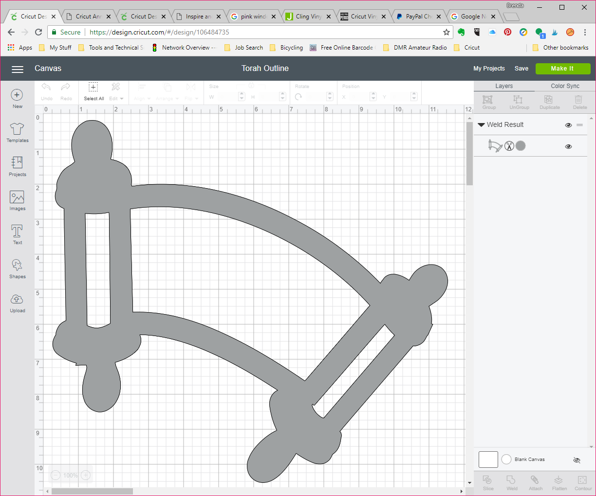
I decided to try my hand at doing a multilayer alphabet based on that callibration grid.
The work required figuring the placement of the pips (holes), creating a complex path in Illustrator, then creating and inserting the line elements. Finally, the whole thing had to be imported into Design Space, where I welded the paths of the line segments and ditched the extraneous ones I used for editing.
My character set is limited to unaccented Western letters, numerals, and a couple of marks one might expect to see in player names. I chose orange as a neutral working color. (Resistance players will be able to color the lines blue, while Enlightened players can change it to green.) Each letter and background is grouped, and will need to be ungrouped before changing colors. The current design does not have a white background, so you might need to add that as well.
Ingress players will notice a couple of things besides the weird orange color: some of the characters are identical to glyphs seen in the Glyphtionary. I've been able to change two from my original design, but my "I", "V", and asterisk still duplicate official Glyphs.
The Glyphs themselves are also available as cut files on my Cricut profile.
The other day, I got an idea for a T-shirt for Simchat Torah, the holiday that celebrates our rejoicing over finishing the annual public reading of the Torah and the beginning of the next year's cycle. I wanted to start with a black or navy T-shirt and a bleach resist process to create a bit of a glow around the image of a Torah, with the word "B'reishith" ("In the beginning") in the center, and a flared star behind the last letter (Taf). The idea was to echo the concept of separating the light from the darkness, the First Day.
As the design formed in my mind, it echoed the words of two religions:
In the beginning, [The Name] created the heaven and the earth. [Gen. I:1]
In the beginning, there was the Word, and the Word was G-d... [Luke I:1]
Having had some questions about bleeding with a paper resist, and wanting an effect that would be produced by bleaching onto a damp shirt, I chose to use a reverse stencil to set up a wax resist for batik. My original plan for the stencil was to cut a piece of plastic poster board, which I've found to be an excellent and inexpensive stencil base. (Note: it does need to be cut down to fit through a Cricut or other home cutter.) My first cut, set at "stencil vinyl", didn't penetrate the plastic. My second, set for "Stencil Vinyl" (pressure 171), didn't penetrate completely. I tried cutting again set at "Stencil Film - 0.4 mm" (pressure 341), but forgot to reposition my cut, so I ended up ruining the stencil material for this particular use and had to use Cricut Stencil Vinyl instead.
[Aside: I was completely underwhelmed by Cricut Stencil Vinyl. It had an adhesive back, which meant the stencil stuck to itself as I tried to remove it from the backer film, and it was so thin that my stencil tore in several places. It didn't easily lend to using both the original and the reverse stencil, and it doesn't lend easily to stencil reuse.]
After much materials wrangling, I finally positioned my stencil in place and waxed my resist area. Removing the stencil was another chore, as my wax was harder than the stencil material and I would still need the stencil for the final splatter paint.
I dampened the shirt and started spritzing bleach. I probably should have bleached first and watered later, since the glow area wasn't as bleached as I would have liked, and extended much further than I would have liked.
After bleaching and wax removal
After washing to remove the remainder of the beeswax, I applied various splotches of fabric dye and water bleeds to bring the bleached area back to about where I wanted it. Overdyeing didn't help as much as I would have liked, but it did add a lovely layer of complexity to the shirt.
After overdyeing
Next, my lettering. After a bit of hemming and hawing, I chose silver foil (to mimic the "dressings" we have on many real-life torahs) for the letters and a silvery holographic vinyl for the "star". Choosing Shlomo STAM for my typeface was a no-brainer, since I wanted to echo the formality and divinity of the Sefer Torah. Unfortunately the holographic vinyl didn't show up as well as I wanted, and neither vinyl wanted to adhere well at the fussy, tiny points.
I finished up the shirt by reapplying the stencil to the entire torah area and splattering the shirt with silver Liquitex acrylic ink and silver Ph. Martin pen ink to create th effect of stars in the firmament surrounding the Book of Creation, separating the Earth from the Heavens...
Completed T-shirt
"B'reishith" is a one-off, an "artist t-shirt". But I'd like to take another go at trying to simplify the process of something a bit closer to my original vision.
As you might notice from my most recent posts, I'm on a bit of a roll working on Jewish designs for Cricut and other electronic cutters. I tend to focus more on Jewish themes around the major holidays, as well as in response to an overabundance of nominally-Christian-themed arts and crafts.
Before I commit T-shirts to the designs I'm creating in my Design Space portfolio, I need to test size and proportions to see if the concepts in my mind will work.
Because it's relatively cheap, cardstock is my go-to prototyping medium. Cutting paper gives me a good idea of how long a design would take to produce, whether my design is too complex for the medium, whether the size I have in mind is appropriate, and whether or not it will scale up and down.
My first prototype of "David Ben Avraham/Bar Mitzvah" went a bit awry. I like to prototype lettering layers by setting them to "write" loading a fine point Cricut marker into the "A" tool side rather than cutting and having to worry about all sorts of little cut-out letter shapes floating around. I used 12" x 12" paper and the oldest of my light grip mats. Unfortunately, the "grip" has worn off and the mat didn't load correctly. I cancelled the cut halfway into the write. Then, for whatever reason, I reloaded the project on the same mat (and reusing the same paper), but with the letters set to cut out instead of print. Pieces of cut-out letters went skittering around the mat, getting stuck on the point of the knife, and doing all sorts of nasty stuff. That said, I learned some really important lessons.
My original design concept has too much information on it to be legible at ten feet, regardless of whether I print it at 10" (normal women's T-shirt design width) or 12" (full width of the cutting path and of heat transfer vinyl).
Even with basic cleaning up, the hand-sketched design had enough irregularities that it took the Cricut an extremely long time to run through what should have been very basic cuts.
A distinct "edge" around the sides of all the pieces and edges in the project would have been very difficult to weed and to register properly.
So I spent several hours tracing over my design with Illustrator's "arc" tool and "direct selection" tool, translating my pencil and marker strokes into vector paths and Bézier curves, and eventually into shapes that would take color (so I know they are complete paths, and so I can separate them and organize them by color and layer in Design Space). Unfortunately, two of my complete paths refused to take a color fill. Sigh. Once that was done, I imported the .svg file into Design Space.
After organizing my layers, I ran a test cut in paper:
While the separated disks and sides of the scroll ends are nice in theory, I forgot to duplicate, slice, and dice the top handles, so there are two paper pieces where there should only have been one.
I fixed up the handles and set the three scroll surfaces to two different shades of brown.
A second, flatter version, welds those pieces into a single piece suitable for iron-on, though in a more cartoonish fashion. I would have loved to have been able to weld the open text and scrolls into a single piece for that version, but every time I tried, the refuses-to-fill center portion caused the entire shape to disappear. I left the text out of this one; it's just the template.
Another method I tried is a bit more stylized, using thick lines instead of different colors of heat-transfer vinyl. This style would be nicely visible, but leaves very little room for lettering.
I'm currently working on a T-shirt design for a sandek, the equivalent of an infant boy's godfather. I'll gather a few basic designs into a portfolio to prove I can create them, and customize from there as needed.
After talking with an Observant Jewish friend, I got the idea for a design I felt might be a bit more appropriate for a Bar Mitzvah t-shirt.
Design Sketch
Jewish men tend to have strong memories of the parshah (weekly Torah and Haftorah (Prophets) readings) they were required to learn for the public synagogue performance that defines most modern B'nai Mitzvah (Bar Mitzvahs). The readings are tied to specific weeks of the Jewish calendar. I came up with the graphic idea of a Torah scroll, open for reading, with the Bar (or Bat) Mitzvah's Jewish name, along with the parshah and date (intended to be written in Hebrew). I used "David ben Avraham" as a generic male name, and since my Hebrew and Jewish learning isn't that great and I wasn't at home when sketching, I chose the parshah "Vayyera" as one whose name I remembered, sketching it in English to be customized in Hebrew for any particular Bar Mitzvah.
Once I got home, I used a couple of brush markers to ink the outlines of the scroll, imported it into my graphics programs, and uploaded it into Design Space.
Note that the lines have been thickened, and the rollers colored in a single (flat) brown to make them easier to cut and weed. (I have since added a white underlayer for the parchment.)
Following the method I outlined in my previous post, I added my sample Bar Mitzvah boy's name and the words "Bar Mitzvah" in Photoshop and curved the text appropriately:
Vertical Text Typing Reversal
The problem came when I started trying to insert the vertical text in Photoshop: because I forgot to check the "switch orientation" icon, the letters were jumbled together, and when I started separating them by putting each on a separate line, they disappeared... and then they appeared, in reverse order. Even when I copied my text into vertical orientation, they were in reverse order... until I typed in my text into Character Map as it normally read.
So, if you are looking to include vertical text in a right-to-left language, you will need to remember to not reverse the order of your letters, with a notable exception:
"Ki Tetze"
I changed my sample parshah from "Vayyera" to "Ki Tetze" (כִּי־תֵצֵא) when I started blocking out my text. My main reason for this was a shorter name. That said, it's two words, and the last letter (yad) of the first word doesn't go all the way down to the baseline.
Because I was having trouble getting vertical text in Photoshop, I selected a system font with Hebrew characters and copied my text into Design Space. At first, the typeface I'd originally chosen didn't show up in my system fonts there, but that was because I'd forgotten to refresh the tab to refresh my system fonts index.
Regardless of whether I entered text in Photoshop, Illustrator, or Design Space, I had to play around with line spacing to get the letters to appear as cohesive words, and with the size of my text box to make sure all those letters appeared in the text object. That said, the vertical orientation — and what I could do with it — varied from program to program.
Slanted Text
Because Design Space keeps each text block as a separately editable, but not warpable, object, rotating the text was sufficient to get it to align with the torah scroll. That said, the amount of difference in line spaces, along with the common use of the character yad as a vowel, required me to put "Ki" (kaf-yad) on a single line, with "Tetze" following as a separate vertically-aligned word.
Both Photoshop and Illustrator have better line spacing, however, keeping my letters as text causes them to handle text rotation differently from Design Space, as well as differently from each other.
Since Design Space treats each text object as a single, image-like object, using the rotation handle to rotate my vertical text ends up perfectly aligned to my slanted rolled parchment, even though each letter is on a separate line. If I place each letter on a separate line in Illustrator, rotating my object will cause my letters remain upright, but indent each line to follow the object's slant.
Both Illustrator and Photoshop have text-orientation toggles that let you type normally, but format your letters vertically. In CS4, which is the (admittedly-ancient) version of Creative Suite I'm working with, the toggle is under the "Type" menu in Illustrator. In Photoshop, with the text tool selected, it's a small "T" with vertical and horizontal arrows that appears just to the left of the typeface selector on the text ribbon. That said, I had to rasterize my vertical text in Photoshop — making it ineditable — before I could rotate it.
Finding New Faces
Being that I'm looking at doing some more artistic work with Hebrew text, I looked for and installed several dozen different free Hebrew typefaces I found at sources such as WebToolHub, FontSpace, Free Hebrew Font, AlefAlefAlef and the Open Siddur Project. I was looking primarily for a couple of faces in Hebrew "script", of which I had none in my collection, as well as some variations in display fonts that would make for interesting (and potentially marketable) items.
These showed up nicely in Photoshop and Illustrator as expected, but didn't show up in Design Space until I saved my project and reloaded the tab.
Dates?
I'm sufficiently unfamiliar with the system of using Hebrew letters for numbers that it's going to take some more work before I'm able to complete the left-hand scroll with a reasonable sample Hebrew date.
Working at Michaels, I've seen a lot of T-shirts, hats, and sashes that say "Bride", "Bridesmaid", "Team Bride", and so on. I've also seen a lot of Bar and Bat Mitzvah favors that say something like
David's Bar Mitzvah
3-16-18
Regency Hotel
Mazel Tov!
That's fun if you're Reform, Conservative, or have many non-Jewish friends and family attending. But what about my friends and customers who are more "Observant" — a heading which includes Orthodox, Modern Orthodox, Chassidic, and/or Haredi — customers who, if they wear T-shirts (and some of them might) would prefer to have that done up in Hebrew lettering? What about modern versions of the aprons my mother and grandmother wore growing up, embroidered in Hebrew with the words "Yom Tov" (holiday) or "Shabbat" (Sabbath), or the towels and potholders labeled "Milchig" (dairy) or "Fleischig" (meat) in the local Judaica shop?
Wouldn't it be fun to do those up on the Cricut?
And that's just Hebrew. How about my Muslim customers, my Russian customers, my Asian customers... people who speak and observe their religions in languages not served by the Western alphabet?
It's possible, but it may take a bit of a workaround.
Since my linguistic vocabulary is limited to a few Hebrew and Yiddish (which uses a variation of the Hebrew alef-bet) words and phrases, my examples will be taken from those languages.
Getting the Right Fonts
On the plus side, Windows (and I presume Mac OS) operating systems include access to the full Unicode character set for many typefaces, which means (in theory) I could use Character Map to bring up my characters, copy them, and paste them into Illustrator, Photoshop, or Design Space. Unfortunately, my current version of Windows and my old version of Adobe Creative Suite don't always talk the same typeface language (Open Text versus the older PostScript and TrueType), so it's a bit hit-and-miss as to what's available where, and whether or not the font designer added in a Hebrew character set.
At least for Hebrew, a quick way of learning if the typeface supports it is to load a blank document into Word or Photoshop, select a text area (or text tool), and look at your font dropdown menu. In Word, the typeface's primary alternate character set will be on the right, in the direction that language is usually read. In Photoshop, typefaces with code pages for Chinese, Japanese, Korean, Arabic, and Hebrew alphabets will show up organized into sections below the main list of typefaces, with a few characters from each to show how the typeface looks in that codepage.
A more thorough (but tedious) way to check if any individual typeface has a particular character set is to go into Windows' built-in Character Map, select your font, and scroll down through the code pages. While your primary language can be directly entered from the keyboard, your alternate-alphabet language may have to be loaded by searching for your character by Windows' name for it, or by scrolling down to your desired character and double-clicking.
Windows Paint, Photoshop Workarounds
If I try to upload a text file into Design Space, it'll get rejected — and I can't save a Windows document to an image format Design Space supports. But outside of Illustrator, Photoshop, and Design Space, there's no good way to turn text into images, except by screen capture. For me, the easiest way to save a screencap is to paste it into Windows Paint, crop out the extraneous information, and save it. (I could use Photoshop, but for something that quick and simple, I don't need Photoshop's long load time and large system overhead.)
Because I'd been having font issues in Illustrator, I did some basic composition in Word, capturing my screen and pasting it into Windows Paint, cropping down to my text, saving in .png format, and importing into Design Space.
Example: "Sandek" (one of the godfathers (usually the grandfathers) at a brit-millah). Typeface: Frank Ruehl.
Layers and Effects
I hoped I'd be able to get around some of those codepage issues once I added Hebrew and Yiddish languages into Windows, but there are still things I can't do directly. As an example, I can get a very even large outline around a letter in Illustrator by duplicating the letter, adding a heavy stroke to the duplicate, and placing it behind the original letter. Unfortunately, saving the file in .svg causes Design Space to lose the stroke information, and I get two identical copies of the same letters.
Example: "Kallah" (bride). Original design as created in Illustrator. Typeface: Rod Regular.
Example: "Kallah". How Design Space interprets the .svg file
I found two ways to get the correct layering. The first was to export each layer individually as a .png file, import them into Design Space as cut-only images, load them both onto my design mat, resize them and align them to line up correctly.
Correctly aligned layers in Design Space
The second way was to export my design to Photoshop, color the bottom layer text the same as the stroke color, and save each layer separately in .jpg format.
Typing Text Directly
It's not impossible to use non-Western fonts directly in Design Space, but I will note an issue with non-left-to-right codepages: when I've selected Hebrew as my system language, Design Space (as well as Photoshop and Illustrator) will render Hebrew correctly right-to-left, but in order to have a legible, legitimate word, I have to type in my characters left to right.
"Kallah" rendered as typed in Design Space. Typeface: David Regular
As you can see, my text is entered correctly from right to left, but the characters are rendered left to right. For Hebrew, Yiddish, Arabic, or other right-to-left words to appear correct, I need to enter them in reverse order.
"Kallah" properly rendered, typed in reverse order.
Some Final Notes...
Being unfamiliar with the usual way of entering "pointed" characters, I had to use Character Map and scroll down to the very bottom of the code page to find the Kaf with the dagesh — the dot in the middle — that differentiates it from a Khaf.
Because one of the things I was looking for going into this exercise was images for Rosh Hashanah, I found what appears to be a good source for Jewish, Muslim, and other religious and ethnic graphics. The images are not free, but they're reasonably priced, and the site doesn't require a paid subscription to look at the packages.
The fun font for "David's Bar Mitzvah" is "Bungee Shade" from Google Fonts, which is a collection of typefaces Google publishes for Web use.
One of the things I've learned really quickly about my Cricut is it can create a lot of wasted vinyl and specialty cardstock. While I've been pretty lucky about getting my initial materials on sale, that's still a dollar or more per 12" x 12" sheet of material, with a lot of leftovers from the small projects I've been working on.
One option for using these leftovers is to cut your printed vinyl close to edges of your design before weeding, and use the leftover unprinted vinyl for another project. This is fairly simple if your designs are all small and relatively linear, like the geocaching reference number for The Other Half's car, or the starship profile I ironed on my multiple-process mixed-media T-shirt.
It's a bit less simple if you've printed out a corner flourish for your desk or notebook.
In the former case, you can fill a sheet with multiple copies of your artwork (if you need them). As an example, I can print my computer club's logo two-across on a 12" vinyl sheet, and then cut off the remaining nine inches for another project.
As long as your vinyl sheet has a ninety-degree corner (more or less) to align to the top and left sides of the mat, and it covers the area of the mat that will be printed, you're good to go.
If your vinyl scrap is more rounded, you may need an iPad or an iPhone and the Snap Mat feature of Cricut's DesignSpace app. (Note: there's a beta version of DesignSpace for Android, but it doesn't have Snap Mat.) The way it works is, you lay your vinyl (or other material) on the mat, take a picture of the mat through the app, and use the Move handles to move your pieces to where your vinyl is on the mat. The process is a bit slow and tricky at first, but as long as your Cricut registers your mat properly, you've got a great way to save material.
But what if your piece has one or more large interior spaces, the type which can't be cut (except maybe carefully, with a blade on a self-healing mat), and/or which is better weeded? Isn't there anything you can do with that?
Of course there is... at least, I think there is. Here are some of my hypotheses and tests:
Background: ready-to-cut eat transfer vinyl consists of two (or sometimes three) layers: the clear carrier layer, the effects layer (in holographic and reflective HTVs), and the adhesive layer.
Because the carrier is already resistant to melting at iron-on temperatures, can it be used as a protective layer for other iron-ons (such as layered HTV or typical inkjet t-shirt transfers)?
So far, it seems to work OK for regular HTV. I've used it to iron hand-cut reflective hearts onto an old pair of cycling shorts to improve my night visibility.
I haven't tried it yet with iron-on fabric or inkjet t-shirt transfers.
After weeding, the exposed part of the carrier is tacky — tacky enough to grab weed scraps from either your iron-on project or your adhesive vinyl project. Can these be used as carriers to use the weeded vinyl?
If I have a large piece of HTV that has been weeded. Is the adhesive bond strong enough to reuse the carrier and have my Cricut cut the scrap vinyl?
So far, I've only tried it with the carrier from glitter vinyl.
It worked (relatively) fine for a scrap of reflective iron-on, which is almost as thin as foil HTV. The big issues were that the scraps could stretch out of plane (so they wouldn't lie flat on the carrier), and that it was difficult to keep bubbles from forming
After re-cutting
After re-cutting - close-up
It didn't work as well for the scrap of glitter HTV, largely because the HTV didn't want to adhere well to the used carrier.
Can I reuse the carrier as transfer tape for adhesive vinyl?
Sadly, the answer for this appears to be "no". The HTV carrier is thicker and less flexible than the regular adhesive vinyl and its transfer tape. Even after burnishing, my Oracal 651 and Cricut Premium Vinyl both wanted to stay adhered to the carrier rather than my project. (Sorry, no pics for this one)
Similar questions exist for regular (sticky-back) adhesive vinyl and its backing. As long as the weeded scrap stays in plane and has enough stick to adhere to the used backing, the Cricut should work just fine.
Of course, if you're going to try to reuse non-heat-transfer-vinyl in this way, you will need to make sure you keep the adhesive as pristine as possible, and the carrier must be free from lint and scraps as well.
I hope this helps some of you electronic-cutter folk get some more mileage from your materials.
Just because #IWorkAtMichaels doesn't mean I have input to any of the projects you'll find on our website. While I do get advance access to our classroom projects, the instructions are already done and dusted by the time we get them.
That said, large companies such as Michaels and Wilton still move at the speed of print.
By that, I mean that product and project development cycles can run on the order of months or years, between identifying trends and their "stickiness" (projected life cycles), product design, prototyping, manufacturing tool-ups, packaging, marketing, and distribution. (When I was a teenaged member of the Girl Scouts' American Girl magazine's Editorial Advisory Board, we learned that the content of each issue was planned a year in advance, giving the editors time to line up experts, writers, and photographers, go through several rounds of copyediting and layout editing, getting the photography and graphics correct, and adding in reader contributions to fill the space to create the glossy magazine we looked forward to receiving in our mailboxes each month. View some of those vintage covers here.)
While electronic tools have sped up the writing and proofreading process to the point where many bloggers can post something daily, collaborative efforts that require research, beta testing, and/or technical copyediting still take time — and if you're publishing thousands of new pages (or updates) daily, some errors are bound to slip through.
When it comes to our in-store classes, I'll pre-read the Leader's Guide, figure if something's wrong or missing, and correct — even on-the-fly if we're missing one or more supplies, if a student wants to customize a project, or if an instruction step is missing. This is one of my strengths as an instructor.
Projects that originate on the website are another story. We only see them if we click through to the project. Today's email linked to a project whose supply list missed one of the necessary tools. I ended up using the customer service chat option to get the error submitted for correction.
All of us want our readers, students, and customers to be successful replicating the projects we post, and personalizing them for their own tastes and needs. The beauty of electronic publication means we can accept comments and error messages, and we can post-edit published pages to improve our users' success rates.
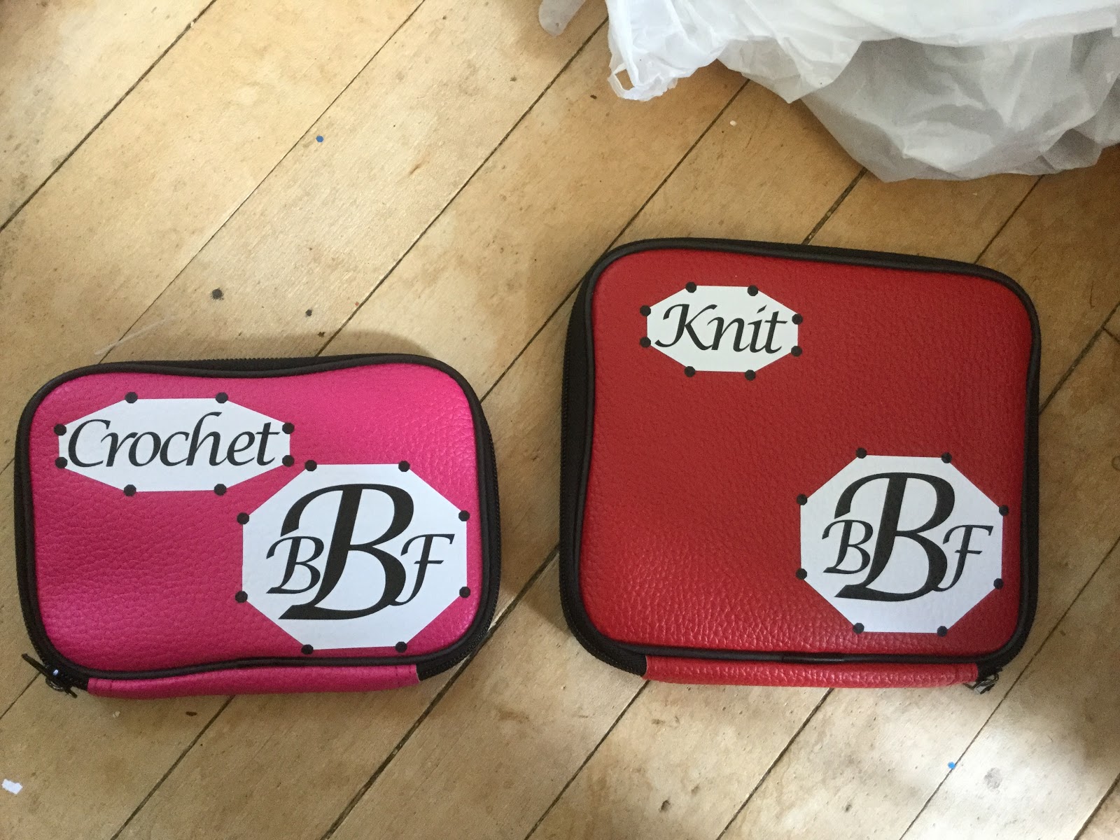
A couple of months ago, I finally purchased a Loops & Threads case in which to store as many and diverse a set as possible of my loose crochet hooks. (I have a complete set of Boye steel crochet hooks, 00 to 14, in their own case, as well as a number of duplicates in the 12 to 14 range because they sometimes bend out of shape.) The Loops & Threads case has one side sized for steel hooks, and the other for aluminum hooks. With space for 10 aluminum hooks and 15 steel hooks, something has to give in terms of completeness. The oversized plastic hooks (sizes P and up) are obviously the first to go — but I rarely use them to begin with, and they're too big to get lost easily. But the collection of hooks I have in that case is not really the issue here...
The real issue is that the size of the hot pink, textured faux-leather zip-around case is not all that much smaller than the red, textured faux-leather zip-around case that holds my Loops & Threads set of circular knitting needles, with the result that the two get easily confused in low light (or when I'm "looking" with my hands rather than my eyes, which is frequently the case).
I decided to take advantage of my Cricut to mongram and label the two cases and (hopefully) avoid future confusion.
That said, most of us seamstresses and yarnies could really use better organization for our collections of hooks, Tunisian hooks, needles, circular needles, double-pointed needles, yarn needles, tatting shuttles, doll needles, tapestry needles, embroidery needles, and sewing needles... Especially when we have our own collections as well as those we've "inherited" from friends, relatives, and foremothers.
On Friday, July 27, Michaels stores across the country demonstrated the Cricut EasyPress for the nation's teachers.
As a home sewer and occasional iron-on-t-shirt maker, the EasyPress has been an interesting product to watch — although not necessarily one I really need. That said, our in-house guide said that the demonstrator should be an expert at the EasyPress so she can answer teachers' questions. So, I took a few hours the day before the event to familiarize myself with the EasyPress machine and its accessory EasyPress mat.
I came prepared with pre-cut designs for a couple of T-shirts, using several different types of Cricut and Siser heat transfer vinyls (aka "iron-ons") as well as a fabric iron-on and some fabric to which I'd previously applied HeatnBond® Ultrahold, my stocks of HeatnBond® Lite and HeatnBond® UltraHold, a few T-shirts, a baseball cap, my tailor's ham, my Quilter's Cut 'n Press and some scraps of polyester and linen, as well as a few rolls of various types of HTV (heat transfer vinyl) and scraps from my cuttings and weedings.
EasyPress Versus the Iron
My iron is still from the days where there's a dial setting that goes Low (Acrylic/Silk/Nylon), Medium Low (Polyester), Medium (Wool), Medium High (Cotton), and High (Linen), with steam options not kicking in until you get at least up to Medium heat. I've done enough burn tests on scraps to know what burnt silk, polyester, wool, cotton, and linen look like and smell like. That said, I didn't know how the EasyPress's maximum setting of 360° compares until I looked it up just now. [Update: on July 30, Cricut announced the Easy Press 2, which will debut Fall 2018. It will come in three sizes and heat up to 400°.]I do know that some customers have returned the EasyPress because it doesn't get hot enough for their needs — which is why I brought along both cotton and linen samples, which generally require the highest heat to press.
The EasyPress has a square sole plate with rounded corners, rather than the somewhat shoe-shaped standard household iron. As a presser, it has no vents — which means it heats more evenly (no more steam-hole marks in your ironing). Its larger area means it can potentially press larger, flat pieces of fabric more rapidly than an iron. It comes with a sample project: a glitter iron-on teacup and a 4" x 4" piece of canvas fabric.
The EasyPress is heavier than a regular iron, but that should mean you can just set it down on your iron-on. It seems to do OK that way for basic ironing, but it still left shadow creases in my cotton and linen samples. That's probably because linen and cotton usually require steam pressing, but the EasyPress is designed around keeping one's work as moisture-free as possible.
The size and weight of the EasyPress make it difficult to maneuver around curved pieces; the logo I tried to iron on a hat never managed to "take" correctly, and I ended pulling it off.
While the EasyPress might be useful for sheer cafe curtains, I wouldn't chuck my home iron for it.
The EasyPress Mat
The 12" x 12" EasyPress Mat we were given is just a little bit larger than the EasyPress, enough to lay out the design area of an average meant-to-be-tucked-in adult t-shirt, and about the same size as my 12" x 12" Cut 'n Press. (Both 8" x 10" and 16" x 20" EasyPress mats are also available.) Continuing with the "as dry as possible" meme, the mat includes a heat-reflecting inner layer as well as a moisture wicking layer. The mat is flexible and could be rolled if needed.
Placed on a hard table, the EasyPress Mat is about as stiff as a padded ironing board, and not nearly as stiff as the padded side of the Cut 'n Press. The fluffiness of the mat is one reason most iron-ons require the user to press down on the EasyPress.
Setting Up the EasyPress
The EasyPress comes with a quick reference card of settings for the time and temperature needed to adhere different types of iron-on to different types of fabrics and non-fabric surfaces; a more complete chart is available on the website. No matter where you set it last, the EasyPress turns on to a default setting of 250F with a 30-second timer. You press the temperature or time button and the up-and-down arrows to set your temperature between 150 and 360F, and your time between 1 and 300 seconds (5 minutes). The device has a safety timer which will shut it down after 10 minutes of non-use.
While the charts suggest temperatures as low as 185F for delicate fabrics such as silk, and times as low as 10-15 seconds, the average iron-on appears to require 30 seconds at 340F — and as it turns out, the higher temperature didn't seem to harm either my polyester sample or vinyl-on-vinyl layering.
Testing
As noted earlier, my iron-on fabric did not adhere well to my baseball cap. It was fine on one of my t-shirts, though. I'm pretty sure the hat's curvature had a lot to do with that.
My other tests were: reflective HTV on canvas (took a lot of time) and on a t-shirt, regular and metallic HTV on a t-shirt; two varieties of HeatnBond on cotton, welded onto black linen; scraps of regular, metallic, and glitter HTV on linen, and regular HTV on polyester. No matter the heat setting or the amount of time, nothing seemed to burn, char, or do something else. That said, if I forgot to press the countdown button, or wait for the press to come up to temperature, and accidentally laid the press down on a sample, it held fast to the linen fabric when I removed the iron two or three seconds later and the Siser and Cricut carriers even peeled nicely!
Thoughts
The EasyPress is a fun and easy way to add "iron-ons" to T-shirts, towels, and any surface that can be kept flat and wrinkle free. It's $149.99 price is comparable to a high-end iron, but you don't get the options of steam, spray, vertical steam, and/or cordless operation that those irons provide (and its cord does get in the way), so it's more of a companion tool than a replacement for your trusty household iron. That said, if you do a lot of iron-on, the amount of time it will save you might be well worth the price.
While I work for Michaels, my thoughts on the EasyPress are my own.
Registration: the alignment of multiple processing passes on the same sheet of paper, so a single multicolor or multiprocess image is produced.
Coming from the world of photography and printing, I see perfect registration as a requirement to make sure my images and cut works line up so there's no offset of one color to another, or of image to cut. It's something I expect of any color printer — and which, until now, I expected to be standard for any cutting machine. If I have to manually align a paper for multiple passes, I'll set my program to print the registration marks which allow me to perform the alignment myself.
One of the issues I've been having with getting my Cricut to do what I want it to is its inconsistency in registering to the same spot on its cuttting mat, or — more importantly — to the material on the cutting mat. This is annoying because it makes it difficult to do precision cuts on unusual shapes, and to do registered cuts on preprinted materials — such as personalized cupcake wrappers and flags for an event.
Cupcake flag and wrapper for New Jersey Libertarian Party event
Cricut's Design Space has a "print and cut" feature which is supposed to make this sort of thing easy: print your design out onto an appropriate paper through Design Space, which adds registration marks to your graphics, and then cuts out the intricate shapes of your printed item.
There are some problems with this:
1. The maximum size of a print-and-cut graphic is about 9" x 6", which is nowhere near the size of the standard cutting mat, and a bit small for adult t-shirts.
2. The "print" part of print-and-cut is much too low a resolution to be useful
3. The "cut" part of print-and-cut either tries to cut out every single color change, causing the knife to shred the project, or only cuts the outlines of the printed portion (as if you were making a sticker), with no obvious option for anything different.
DIY'ing the sequence isn't much better. While you can print and adjust to the entire size of the sheet, the cutting will end up in different areas from one mat feed to the next. A few YouTubers have suggested that adding a bounding box at the edges of your image (or paper) will help with registration, but I've not found it a perfect match.
The red rectangle is my Cricut's DIY "registration" marks for US letter-size paper
That said, there's one additional step that looks like it might help (though it may "ruin" a mat): I ran an old mat through the Cricut several times with the bounding box set to "write" and found that my Cricut has a specific offset for 11 x 8.5" paper and cardstock (US standard letter size paper, matted landscape). If I set my letter-sized paper to the marks I've made on the mat, I'm getting something closer to a usable registration, if not what I would consider acceptable registration.
Registration Errors
Note that the bounding lines on the flags and some of the wrappers are visible, and how they vary from cupcake to cupcake.
On the plus side, after a lot of trial and error (and wasted cardstock), I got the Cricut to cut everything out without mangling the pre-printed images. On the minus side, I still had those outline marks. Since this was a bit of a test project, I went with the stock I managed to print out. For future events, I can "hide" the outline layer so it won't print, and my cupcake flags and wrappers should be perfect.
If you spend any amount of time in a craft store or among paper crafters, you will hear them toss about words like Cuttlebug, Sizzix, Spellbinders, Silhouette, Cameo, and Cricut. Each of these are machines that help a crafter create precise embossed or cut shapes that can be assembled to make three-dimensional cards, scrapbook page accents, centerpieces and other specialized paper goods for special events, including custom favor boxes. A family with a couple of Cricut machines and a lot of time can save enough money creating their wedding, shower, or baby-naming supplies to pay for the cost of these expensive cutters and the amount of time it takes to learn how to use some of them.
Because I'm not into scrapbooking or planners, and I don't have children or nearby family, I don't have a direct need for these machines; however, many Michaels customers purchase consumables for them, and some even earn their incomes by using them. That means it's a good idea for me to understand how they work.
Our classroom includes a Sizzix Big Kick, a Cricut Expressions, and several dies and embossing folders for the Sizzix. The Sizzix is pretty straightforward: you put your paper on a plate, put your die on it, put another plate on top, and crank it through the machine. Then you take your pieces and assemble them.
The Cricut is another matter entirely. The Expressions model has a small number of built-in images and fonts, but mostly relies on proprietary data cartridges for your projects and designs. You use an awkwardly slow built-in display to try to lay these out in a way that either makes sense or wastes the least amount of consumable materials — or you can (or rather could) use a USB connection and a PC program (Cricut Craft Room) to try to manage things more quickly. Then you prepare your materials and tell the machine to do its work. Later Cricut models (the Explore series and the current top-of-the-line Maker) use different software (Cricut Design Space) that (hallelujah!) allows you to upload your own designs, rather than just relying on cartridges and whatever Cricut has made available through their online space.
It's that ability to do truly custom work that has had me interested in playing with the Cricut Explore series, and that past tense that has gotten me to finally purchase what, for me, is an expensive toy: Cricut shut down Craft Room on July 15. The nominal reasons for the shutdown is because the software is based on Adobe Flash, which is (1) insecure and (2) no longer supported by Adobe.
As part of the Craft Room sunset program, Cricut generously offered Craft Room users a significant credit towards purchasing a Design Space-compliant model, valid through July 15. I waited almost until the last minute before taking the leap and buying a Cricut Explore Air with a basic set of starter tools. Now, I'm working on translating some of the logos my organizations use into Design Space-friendly files and and trying out some ideas for custom decorations for our events.
Once I get the hang of the translations, I'll be able to see what sort of market might exist to give me some return on this investment...
Much to my surprise, calligraphy is becoming popular again.
Back in my college days, schoolteachers observed that teaching beginning writers a calligraphic hand — either as opposed to, or in addition to, Cursive Writing — had the happy result of students with better, more legible handwriting. Since "Penmanship" (handwriting, with the goal of accurately replicating standard letter forms at all times and speeds) was my worst grade in school, I felt compelled to take up the study.
By the time I graduated, I had a stash of several Osmiroid left-hand fountain pens (yes, I'm left-dominant!) in both standard and my preferred oblique styles, several Speedball handles and an assortment of nibs, a handful of India and colored inks, and a preference for writing ornamental "text" hands on smooth vellum paper.
Vintage Calligraphy Supplies
While I've practiced on and off during the intervening years, (and added a Platignum set and a few Rotring fountain pens to my stash), I put my pens and inks away (I'd thought for good!) when it became simpler and easier to specify a typeface and size on my computer (I usually had several hundred faces installed at any given time) than to struggle with letterforms and slants that didn't stay as straight and as perfect as I would have liked.
While Michaels has sold a limited number of calligraphy pens and inks over the past several years, most customers were only interested in calligraphy markers — whether the Zig memory, Recollections (our house brand), or Speedball Elegant Writer. I've always associated these markers with dull corners, uneven edges, and dried-out inks — nothing worthy of the effort of fine lettering. (Then again, many professional calligraphers feel the same about steel pens as opposed to hand-cut quills and reeds...)
In the past year or so, our calligraphy offerings have expanded. We now have a couple of Manuscript brand sets, as well as a Speedball set or two, a set of Asian calligraphy brushes, and two lines of calligraphy ink.
So, too, has the range of popular calligraphy — although to make it less scary, we're calling it "hand lettering". And instead of using scary, blotty, messy dip pens (or slightly less scary, but still blotty and messy flat-tip fountain pens), we're using brush markers. And the letterforms we're teaching look more like Copperplate than Chancery Italic or Fette Fraktur.
Marker-Calligraphy Supplies
(Which, frankly, is making Copperplate seem a whole lot less scary to me.)
Of course none of pens we sell are designed for lefties, which is one of the reasons I've had to haul my stash out of storage. (The other main reason is to try to give my colleagues a feel for what our calligraphy customers might ask about or need.)
The latest "trend" in this craft area, which our buyers and merchandisers would like to believe is leading this return to hand-lettering, is "journaling". Like "planning", this seems to be an underdefined category. Our "journaling" aisle includes blank books for sketching, visualization, vacation planning, bucket-lists, to-do lists, and possibly even some diary-writing and creative writing. (There's a better-defined subsection of this area called "Bible Journaling", which I would suspect relates to individual and directed Bible study, and includes pocket inserts such as "Prayer Lists".)
During the process of preparing for tonight's "Hand Lettering" class, I've picked up and experimented with several types of brush marker, purchased some left-handed calligraphy markers, and started resurrecting my old dip pens. Unfortunately, both Osmiroid and Platignum have left the calligraphy-pen market, and while I have the tips, my old barrels are nowhere to be found. Surprisingly, though, a few of my inks — at least one of which bears the price tag from its purchase over 35 years ago — are still good. Time to get some new parchment, vellum, and chain-and-laid paper, and start playing with letters again.
As you may recall, I spent some time this fall gathering different brands of fabric medium, different brands and qualities of acrylic paints, and testing them all at different dilution levels to find which would be the optimal combination for painting T-shirts.
The delay in posting the concluding part (parts?) to this experiment was a delay in heat-treating, curing, and washing the test T-shirts.
While the paint swatches were more flexible when warm, I'm not sure how much heat treating did for the preservation of the paint work.
More important is, how well did the samples survive the wash, and how wearable the paint/medium combinations are.
The yellow Liquitex acrylic ink pretty much disappeared into the red t-shirt, but it was fairly transparent to begin with. The more fabric medium in the mix, the less it seems to disappear into the fabric. It's fine on a lighter color fabric, such as the bleached areas on my Boo Christmas t-shirt, and no fabric medium was needed for that application.
The Golden High Flow paint//ink was soft enough without fabric medium, and looks like the Delta Ceramcoat and Americana fabric mediums have minimized what looks like a very minor amount of bleeding of the unadulterated paint.
Without fabric medium, the Golden Fluid and Liquitex Soft Body paints come out as similar textures to the various brands of craft paint, but with brighter color due to their higher concentrations of pigment — which is pretty much the same as before anything was heat-treated or washed. That said, neither is completely opaque.
In general, the thicker the paint, the stiffer the sample patch, even with fabric medium and washing. The thicker paints and applications (e.g., two coats) were also more likely to crack.
Of the craft paints, Folk Art gave the softest finish; it and Martha Stewart are the best for opacity.
The odd swatches of specifically-formulated "fabric paint" were a bit softer than their craft-paint equivalents, but not necessarily more opaque.
My patches of Elmer's "washable" School Glue did not wash out of the shirt, but I'm not sure if that's because I let it set in too long.