Wednesday, March 27, 2024

Language and Cooking

An analogy of the how and why of kitchen creativity

A coworker mentioned that she was not what her mother-in-law called “a natural cook”: she could follow a recipe, but she could not deviate from it in the least. I, on the other hand, can pick up on a general technique and seasoning set and go from there – either following the recipe exactly, tweaking it, or using its basic information as a jumping-off point to get completely creative.

While food is as valid a medium for creativity as any other, there are some basic ground rules we must follow. Some of these ground rules ensure that our food is safe to eat: storing certain foods in the refrigerator or freezer, cooking them to a certain temperature (or to specific visual cues, such as “fluids run clear” or “toothpick comes out clean”), and serving hot foods while they are still hot. Others are more STEM-related, such as the ways different ingredients behave when mixed with other ingredients, or heated or cooled in specific ways.

Once you know the ground rules, the rest can be changed to meet your preferences, available time and facilities, and ingredients on hand.

OK, I’ll admit that’s an oversimplification, but the most basic version of “fun with food” is “theme and variations”. If you’re not a music maven, “theme and variations” is where a section of music, the theme (like the verse of a song) is performed several times in different manners (the variations): soft, loud, fast, slow, staccato (short, distinct notes), arpeggiated (preceded by short notes of the chord it’s on), and so on.

In some ways, that still misses the nuance.

Cookbooks, like many technical manuals, have their own vocabulary. Aside from the abbreviations used to indicate quantities of ingredients (as well as some advance preparation, such as peeling a vegetable, beating an egg, sifting flour, or making sure something is cold, room temperature, warm, or boiling), there are the techniques, such as simmering, blanching, sautéing, pan-frying, whipping, folding, and so on.

This vocabulary is something akin to the parts of speech you learn in Language class. A sentence needs a subject (who or what), an action, and an object (who or what is being acted upon). In a recipe, the subject is understood to be the cook, baker, food preparer, or (“traditionally”) housewife or chef. The objects are the ingredients and the mixtures of ingredients as they are prepared (for example, a roux, which is a mixture of onion fried in a small amount of butter, to which flour is added to brown and thicken). The final object, the conclusion of this tale that is called a recipe, is what you end up eating (or serving to your family or bringing to that church dinner).

But that’s just the basic, overt vocabulary: the “I, you, it, we” and “past, present, future, infinitive”. Unless you know what to look for, you miss the styles, the genres, the sense of what that food is – and by this I don’t mean “how to duplicate what I’ve done” but rather the historical and ethnic origins of a food, how the main ingredients, seasonings, and techniques go together like the various cliques in your child’s middle school…

If, for example, you go into any mom-and-pop pizzeria, you will find shakers of oregano, garlic, and crushed red pepper. When these spices hang out with onions, basil, and tomato, they create a taste profile most of us associate with “Italian cuisine”. If you’re missing a recipe for marinara sauce or arrabbiata, this is where to start.

In addition to soy sauce and stir-frying, Chinese-American food (largely adapted from Cantonese cooking) has a go-to seasoning blend called “five spice”. While the actual blend varies from cook to cook, cinnamon, cloves, star anise, and Szechuan peppercorns are common ingredients. Peanut oil, crushed garlic and grated ginger are often used at the start of a stir-fry, while sesame oil is a frequent finishing touch.

Other Asian ingredients in my cupboard include Mirin (a sweet, seasoned Japanese cooking wine) and rice wine vinegar. Adding these to soy sauce creates a basic “Teriyaki” flavor without having to buy still another special sauce.

If you asked me for a “Pumpkin Spice Latte” out of season, I would steep a cinnamon stick and one or two whole cloves in black coffee for a few minutes, and add a quick grating of nutmeg after adding your steamed milk and your sweetener of choice. Or I might add that cinnamon stick as a garnish instead, allowing you to decide how strong you want your drink flavored.

Any decent chef or food historian will tell you that I’ve only given you a basic, “cultural appropriation” level of those seasoning blends and preparations – and they’re right. It’s a “Do-Re-Mi” level of understanding. But just as Maria tells the Von Trapp children, “When you know the notes to sing, you can sing most anything.”

I hope I’ve given you a few culinary themes to inspire your own variations.


Tuesday, February 27, 2024

New Adventures in Bread

 I managed to spend the entirety of the COVID-19 lockdown hardly baking a thing. Part of the reason was that my sister kept (and still keeps on) filling what little kitchen space we have with all sorts of gadgets she finds at work, and neither she nor the Other Half can find anything in the kitchen unless it is taking up all the working space on the kitchen table. Part of it is, after we account for my sister's stash of orange juice, organic milk, and Vitamin Water in the fridge and her stash of spaghetti sauce in the freezer, there's little place to keep any sort of food for The Other Half and me. Mostly, though, it was because with everything contact-limited, there were prohibitions against bringing home-baked goods anywhere to celebrate (or celebrations at all, for that matter).

I baked my usual Passover sponge cakes, the occasional meat loaf or cottage pie, maybe some knishes or bourrekas, and that was it.

Then again, during my tenure at Michaels, my baking was mostly related to classes I'd taken or taught: first the Wilton cake decorating classes, and later, the holiday cupcake and cookie decorating one-nighters. The rest of it was holiday baking (mostly cookies and cupcakes) and special-event baking (a few major cakes for my STARFLEET group, and an assorted selection of cookies and cupcakes). For the most part, I didn't have time for breads - most of which my sister didn't like, while my Other Half and I were trying to cut down on.

That said, bread has been part of my baking repertoire since my university days. For a while, I would experiment with a different bread recipe almost every week. But bread takes time, and the further away I got from school, the less time (and space) I had in which to make it. Also, places like Whole Foods have made artisan breads available at prices that aren't too excessive for the occasional splurge.

I've been wanting to get back to bread for a while, especially since a lot of the philosophy and science of home bread-baking has changed over the past four decades (wow, has it really been that long?) and along with it, a lot of the ingredients and tools. While I've made the occasional largeish purchase from King Arthur Baking (you're going to see them pop up a lot during this post!), a lot of their ingredients and tools are a bit pricey for my budget. As it turned out, Temu — love them or hate them (market-busting prices on merchandise mass-produced in China) — was the key to picking up an inexpensive baker's couche and a lame (bread-scoring blade). Even so, the tools were sitting in my living room for months...

What finally brought me back to baking bread was... onion soup. The kind that has a nice slice of old baguette floating just under the melted, bubbling Gruyère cheese. I went to get a simple baguette at my local BJ's and they wanted... $4.00... for a loaf that wasn't even the usual BJ's super-size... For something that simple and basic, the price seemed excessive.

I didn't start with baguettes, though. I started back because my store cut back my work hours to barely a few hours a week, and I needed bread in the house. I had the time, I had the ingredients, and I had the know-how.

My first week, I made King Arthur Baking's Irish Soda Bread recipe — which is very different from the stuff sold in stores every March — along with a tried-and-true challah recipe, and a King Arthur recipe for Raisin-Pecan Rye Bread, That's a lot of bread for a three-person household, but my thinking went like this: the quick bread (soda bread) so we could have something right away, the challah would use up old eggs and be ready by dinner, and the raisin-pecan bread was something I expected the whole household to enjoy. 

I skipped the soda bread the second week, just making the challah and the raisin-pecan bread. The latter uses a pre-ferment called a biga, which is a traditional Italian method. It also uses the newer methods of less kneading and a longer proofing (fermenting, doubling, rise) time than the bread recipes of a generation (or two) ago. I was confused by the way the biga and dough felt, and wanted to get a better handle on it. (I need to try it one more time, in a future week, before permanently changing the recipe.) Meanwhile, I started resurrecting the rye sourdough starter I'd dried for storage a couple of years ago; it takes about a week to bring such a starter from flakes to usable starter.

One of the breads I wanted to try making again was a deli-style rye bread, but that was going to take a lot more planning. Deli rye has two components that make it a two- or three-day process: a rye sourdough pre-ferment and an altus, or soaker of old rye bread and water. (I have no idea what the altus does offhand, only that it's part of the recipe.) That was the third week's bread bake. While the size and taste were familiar, the bread itself was much denser than it should have been 

Meanwhile, part of the process of keeping a sourdough culture alive is feeding it and using it on a regular basis. Once you have the mass of sourdough you want to maintain, you discard half of it and feed the remaining half with more flour and water. Rather than throwing it out, King Arthur has a number of recipes that use "unfed" or "discard" sourdough. We've glommed onto the Buttery Sourdough Biscuits recipe. The nice thing about this recipe is that it only makes about a half-dozen biscuits, which is just enough for breakfast without leaving anything to get cold. In the past month I've made it with rye starter, and with all-purpose (white) flour starter, with rye flour, with white whole wheat flour, and with all-purposes flour. Each has a distinct rise, taste, and texture. It's a keeper.


Saturday, July 24, 2021

Mock Tabouli: an Easy Special-Diet Hack

When I'm asked to bring something to a picnic or other share-a-dish event, I try to bring something that ticks the boxes for those who might otherwise be forgotten - so in addition to cakes, cookies, and ethnic foods like noodle pudding or tsimmes (a very sweet beef stew), my repertoire includes vegan chili, meatless Hawai'ian salad, cut veggie platters with dip, or something similar. For this weekend's event, I chose to contribute a dish I called "Mock Tabouli".

If you're not familiar with tabouli, it's a Middle Eastern salad made of finely-chopped parsley, finely-diced tomatoes, and cooked-and-cooled wheat bulghur, flavored with onion, garlic, lemon juice and olive oil. Some versions add a bit of finely chopped mint; others use oregano, depending on your taste.

What makes this recipe Mock Tabouli is that the wheat bulghur is replaced with finely-chopped hard-boiled eggs. This makes the salad much higher in protein, keto-friendly, and if prepared in a contaminant-free environment, gluten free.

The first time I made Mock Tabouli was years ago over Passover, and it was a hack that gave me a reasonable take-to-work lunch option. (Again, no wheat or grain - no chometz.) While I'd never thought of it as having a separate name, I needed to name it to print out an ingredient card for our picnic. Since it didn't have all the ingredients of traditional tabouli, I figured "Mock" tabouli was an appropriate designation.

Note: Ingredient cards are essential for helping people on special diets decide whether or not they can safely eat what you've prepared. "Special diets" includes restrictions based on health - such as those required by people with food allergies or with medical conditions such as celiac disease and diverticulitis - as well as those based on religion, such as kosher or halal diets. An ingredient card includes the name of the dish, the ingredients in it, and allergy or certification disclaimers (such as "may contain traces of wheat, peanut, or citrus"; "kitchen is not kosher", etc).

When I make Mock Tabouli for a single meal, I use two or three eggs to make up a quantity of about two cups of salad. This weekend, I made Mock Tabouli as my contribution to a "bring something to share" picnic; I used about eight large eggs with two whole bunches of parsley and three tomatoes to end up with about two quarts' volume.

As it turned out, one of our attendees has a wheat allergy and was quite glad there was something she could eat!

Mock Tabouli

1 bunch curly parsley, about 4 ounces
1 bunch flat parsley, about 4-6 ounces
3 tomatoes (just over a pound)
8 hard-boiled eggs
2-3 scallions (or one very small onion)
juice of  two large lemons
1 clove garlic
2T olive oil
salt, pepper to taste

optional:
small amount of fresh mint (2-3 sprigs)
small amount of fresh oregano (2-3 stems)

1. Chop the parsley very finely, discarding stem-only parts of the bunches
2. If using mint or oregano, chop this finely, add it to the parsley, and mix well.
3. Finely dice the tomatoes. Add to the parsley.
4. Chop the scallions or onion very finely. Add to the parsley and tomato. Mix.
5. Finely chop or dice the eggs. Add to the other ingredients. Mix.
6. Crush or press the garlic into the lemon juice. Whisk well.
7. Whisk the olive oil into the lemon juice. 
8. Add salt and pepper into the lemon juice mixture to taste.
9. Strain the lemon juice dressing onto the salad. Toss well and chill thoroughly.

Thursday, May 13, 2021

Passover "Pains" and Shavuot Grains

Passover Prep

Earlier this spring, I decided to look at all the secondary (economic, social, social-justice, and so on) issues caused by our politicians' and media's responses to CoV-SARS-2 (aka, COVID-19, the Novel Corona Virus, the 'Rona, etc.) as the modern equivalent of the Ten Plagues of the Biblical book of Exodus. My first design tried to put a bit of visual mnemonics: the "O" in the word "lockdown" looked like a keyhole, I had silhouettes of wild animals behind the line "wildlife incursions", and so on. I ended up with something looking a bit too much like the old "Ransom Note" aesthetic (or lack thereof!) of the early 1990s, so I started again from scratch. After playing around with a couple of different typefaces and moving the plagues around to avoid adjacent plagues of the same colors, I came up with something worth putting into vinyl:

While some of us might have chosen other plagues, or ways of expressing them, I had to keep in mind that my choices had to appeal to a broader, often progressive audience.

The seders themselves gave me more questions, some of which have brought me down an interesting rabbit-hole of published Biblical research. If I come to anything worth raising Ishmael, I'll probably write about it over on The Contrary Point of View.

Moving Towards Shavuot

Starting with the second night of Passover, Jews start a ritual called counting the Omer, referring to the seven-week period of the grain harvest. Conveniently, this period ends with the Biblical holiday of Shavuot (Pentecost) when, by tradition, the Law (the Ten Commandments and the start of the Oral Law that accompanies it) was received by the Tribes of Israel at Mount Sinai. The two-day harvest festival is relatively low-key for most Jews (stay home from work, add extra prayers, study Jewish Law, eat dairy foods), so it's not the sort of holiday that lends itself to a lot of holiday-specific decoration.

However, working at a craft store, and seeing religious designs that seem to focus on the Christian and the arguably-appropriated (dreamcatchers from Native American traditions, mandalas from Hinduism and Buddhism), along with designs that seem to align with Wicca and other European Earth traditions, I feel the need to create some balance with designs that celebrate Judaism.

Inspiration and Symbology

My original idea was to create a Mount Sinai with fire and smoke ascending or descending upon it, the traditional two tablets representing the Ten Commandments in the foreground, and 49 stalks of wheat, one for each day of the Omer. While this might have worked as a drawing or painting, it would have been way too busy for a t-shirt. I ended up with a rough outline of the peak of Mount Sinai, the two tablets (with the Commandments mnemonically reduced down to their numbers), and twelve stalks of wheat (one for each of the Twelve Tribes of Israel) divided into two groups of six, framing the Hebrew word "Shavuot". Those looking for a little more symbolism might recognize that the groups of six are further divided into two groups of three, with the two on the right side set up similarly to the Hebrew letter shin, the first letter in the Hebrew word for "Almighty". 

original Shavuot Design, including background

I didn't want another white T-shirt — I wanted a bit of "natural" color — but I also wanted to use a blank I already had in stock. After examining my stash, I hovered between Bella+Canvas crew necks in Mauve and Dusty Blue, and started putting them together with vinyl colors. I settled on the mauve, using metallic, foil, and glitter accents to create texture in my final composition.


I'm planning to wear it at least once to work before the holiday, and again for a Zoom-based holiday celebration.


Sunday, May 9, 2021

Decades of Font Build-Up: License Issues

I've been "collecting" typefaces since the days when you could buy 5.25" diskettes with dozens of Bitstream*-compatible, PostScript, and other shareware faces for a couple of dollars. (It's more of a hoard than a collection...)  While a number of these have been jettisoned along the way for various reasons, a recent dive into the rabbit hole of "free" online font repositories (1001 Fonts, DA Font, etc.) suggests that I may still have a bunch of these either installed or in archived directories, without any attached license information. Since most cheap and free fonts in the 1990s were either bitmapped, poorly-designed, or cheap knockoffs of better-known faces, and most of us used those faces for personal, or small-distribution hard-copy newsletters, it was unusual for any of us to come to the negative attention of the rights owners (and even more unusual for the rights owners to do anything about it).

Times have changed. If I'm going to make a design "public" — either by putting an image of it (or a photograph of my finished product) on this blog, posting it to a design community (such as Behance, Dribble, or Design Bundles Community) or social medium (such as Pinterest), or allowing it to be searchable on Cricut Design Space — I have to mind my Ps, Qs, and alternate character sets, making sure that any resources I use are under the terms of the rights owner's license, and that I tag the designer, the rights owner, the place I found the resource, and (if a separate entity), the place from which I acquired the license.

This is not always as easy as it looks, and I don't always succeed at this part of my task. The proliferation of "old fonts" — both online and in my personal hoard — doesn't make it any easier.

Looking at the information on relatively recent faces on places like DA Fonts and 1001 Fonts state that those faces are "demo" versions of typefaces that the authors are currently selling on sites like Creative Fabrica and Creative Market. Great! I can play with the face, and if I need it for something beyond the free site's license, I can look up the face and license it appropriately.

Other faces have information on the brand-name foundry from which they came. While a handful of these faces are from current companies such as Adobe and Monotype, many more are from once-big names that have since been acquired by other big names (Bitstream was acquired by Monotype in 2012) or have ceased operation (such as Casady & Greene). So far, I've not been able to find the current owners of Casady & Greene's catalog.

The download page notices for many of the oldest fonts don't include any license information other than "contact the author" about licensing terms or license upgrades. Sometimes there is a link, sometimes a Readme file, and sometimes nothing at all. Unfortunately, a lot of contact information in these Readme files is out-of-date (questionable Compuserve addresses, defunct websites, etc.). Trying to contact those designers could require significant research on the user's part, as well as hoping that the license enquiry email would not be thrown out as spam.

DA Fonts, 1001 Fonts, and their ilk have been around for decades. Like me, I suspect they scraped up typefaces wherever they could find them, and have a back catalog of fonts and faces that they haven't had the time, manpower, or inclination to curate. Unfortunately that leaves them in the category of caveat emptor where type selection options for public-facing designs are concerned.

Obviously, we all have the option to not-use typefaces of questionable licensing when creating something we might want to post or sell. Personally, I need to take the time to curate my catalog and archive anything for which I don't have clear license information (or at least clear licensor information). And if you ever created shareware, donationware, or other freely-available type, you might want to check these "all the free fonts you can download" sites to make sure that anything of yours posted there has your current contact information and licensing terms.


Saturday, November 7, 2020

By the Pricking of My Thumbs - National Diabetes Month

 "By the pricking of my thumbs
Something wicked this way comes."

    --Second Witch, Macbeth IV:1

American Hallowe'en is associated with literary wickedness, cartoon witches and ghosts, jack-o'lanterns, and schlock horror films of decades past. It's no surprise that many Hallowe'en designs draw from Shakespeare's "Scottish play", whether "Double, double, toil, and trouble" or "Something wicked this way comes".

And so I wasn't surprised to see "something wicked" on a crafting YouTuber's t-shirt.

That said, pricking our thumbs (and other fingers) to deliberately draw blood, Sleeping Beauty-style, is a necessary behavior for most people living with diabetes: the small blood drop feeds a chemically active sensor in a device that tells us our current blood glucose ("blood sugar") levels. This information tells us if we need insulin, or sugar or carbohydrates, and whether we are "safe" to drive, to work out, to sleep...

November is Diabetes Awareness Month: American Diabetes Month in the US, Canadian Diabetes Month in Canada, and so on. It is the month of Dr. Frederick Banting's - the discoverer of insulin's - birth; his birthday (November 14) is celebrated around the world as World Diabetes Day.

So it shouldn't be a surprise that the second half of the Wise Sister's quote reminded me of the first, and of my many friends, colleagues, and family members living with diabetes. It took a bit of time to replace "something wicked" with a phrase that "scanned" properly (had the same number of syllables and similar stresses), and a bit longer to do the artwork. The typeface is "feather" by NJ Studio, available at Font Bundles.

Now, to choose a number.

In the "English" units used in the United States, the ideal blood glucose range to which we're asked to manage is from 80 to 180 mg/dl (milligrams per deciliter), with an average non-diabetic number being roughly 100 mg/dl, which is what we tend to see in glucometer advertisements. While a spot reading in this range may not be unreasonable for those of us with what I refer to as "mild" Type 2 diabetes, it's an extremely unlikely number for a person with Type 1 diabetes or more advanced Type 2, and this "random" glucose number is a serious point of contention in our communities. 

My choice of "169" is based on a recollection of one of my Type 1 friends mentioning the 160s in her typical range for something. 

The detail of the blood drops, the lines of the thumbs, and the blood uptake on the test strip mean this design will be difficult to reproduce in vinyl, and may need to be produced as a sublimation print or an iron-on transfer. That said, I think I would replace the readout window with a piece of chalkboard iron-on vinyl so that the person wearing the shirt could add whatever number was current or more appropriate for the time the shirt was being worn.


Wednesday, August 19, 2020

Not-Corned Beef Burgers

 So, in the middle of all the COVID-19 confusion, my state political party decided to hold its annual picnic and general meeting on a Saturday. These are generally pot-luck/covered-dish sorts of events where the venue has grills to use and everyone brings something to eat with enough to share. 

With things a bit of a last-minute for me, and me never trusting anyone else's grill to be have never cooked dairy or pork (or animals that could not ever be kosher), I decided to save myself next-day cleanup mess by bringing along a chili that could top burgers or hot dogs, or be eaten by itself. Unusually for me, I decided on a beef-and-bean chili (I usually make my chilis pareve/vegan so that I can either top them with cheese or use them to top a burger or hot dog). So I picked up several pounds of ground beef and several pounds of dried beans, and set the beans to soak overnight Thursday. 

Technique note: I soak my beans for chili in water that includes onion powder, garlic powder, one or two whole dried chilis, and a few bay leaves. I cook my beans in water that contains similar seasonings. I believe this counteracts the beans' usual blandness.

When I got home from work Friday morning and checked my email, I found a message saying the picnic had been cancelled due to a power outage at the venue. While we had had heavy rains mid-week, it had never occurred to me that power would be an issue: I'm used to doing Field Day (an annual Ham Radio event) with portable generators that ran the radios and the lights, and gas- or charcoal-powered grills to cook our meals.

So, I made as little of the chili as I could to use up the beans, but I still had four pounds of hermetically-sealed extra-lean ground beef in the refrigerator, with no space to freeze it, and with a use-by date a week or two out.

Somewhere along the line I got the idea to see what would happen if I used corned-beef or pastrami seasoning on ground beef, and serve those burgers on rye buns. Researching recipes for corned beef and pastrami were a bit tricky, since most of them started out with already-brined brisket (the sort that is only inexpensive around Saint Patrick's Day) and pre-packaged, whole pickling spices.

After a bit of work, I found  few reasonable recipes for corned beef, and a few different options for pickling spice blends. Since putting whole spices into burgers is (obviously) Not A Good Idea, I had to convert the whole-spice measurements into weight substitutes so I could measure out ground spices to make my blend.

Please note there are a few issues with using ground spices instead of whole spices, and mixing spices into ground beef meant for the grill as opposed to brining a whole brisket for over a week and then simmering it with a fresh packet of pickling spice. These include:

  • Whole spices release their flavor much more slowly than ground spices
  • Salt and acid break down tough flesh and also help infuse spice flavor into the meat (this is why tougher cuts of meat are usually brined or marinated in a wine or vinegar mixture).
  • Depending on whether your spices are freshly ground or have been hanging around a while, your ground spices can have a stronger or a weaker flavor than their whole progenitors.
  • It's difficult to tell a priori how much flavor has infused into a brisket and how that relates to how much of a ground-spice blend to add to ground beef.

Needless to say, our crazy work schedules left me putting off and putting off using the ground beef until it was two days past its "use or freeze" date. So it was "now or never" for putting my blend together and trying it out.

I would have done a lot more fresh-grinding if one of my store-and-grind containers hadn't broken and my hands and arms weren't sore from various recent injuries; as a result, a lot of my mixture came from my very long-in-the-tooth ground-spice rack. That said, it required a bit of tasting along the way to decide how much salt I needed to add in, whether I really had enough mustard, and that ground bay leaf needs a slightly lighter hand, weight-wise, than its whole-leaf component (to avoid bitterness).

Please note that while I purchase a number of my harder-to-find and specific-origin spices from Savory Spice Shop, it is because their nearest retail store is convenient to me (about five miles from home) and has a great selection. Many similar seasonings can be found from brands such as Simply Organic at places like Whole Foods.

The proportions I ended up with were:

  • 11.5 g ground coriander
  • 8 g ground black pepper
  • 14.5 g mustard powder
  • 0.4 g Powdered Turkish Bay Leaves
  • 3 g ground allspice
  • 1.5 g garlic powder
  • 6 g onion powder
  • 10 g sea salt, freshly ground (I use La Baleine as my usual table salt; for a smokier taste I might have substituted something like Hickory Smoked Sea Salt or Alderwood Smoked Sea Salt
  • 0.5 g White Wine Vinegar Powder (for acidity)
  • 3 g Cook's Charcoal Seasoning (to enhance the "grilled" taste)
This resulted in approximately 1/2 c (8 tablespoons) of spice mix, about 2 oz (57.4 g).

Once I got the spice mixture together, the next thing I needed to figure out was how much to use for my no-time-to-sit-and-marinate ground beef. (I still believe the best method for this sort of seasoning would be to season the beef and let it sit in the refrigerator for a day or two before grilling. That sort of "soak" time would require a lot less spice than cooking the burgers immediately.) While most of my as-purchased seasoning mixes suggest using 1/4 teaspoon per pound of meat, I started with an amount of spice which, in whole form, was intended to season approximately four pounds of meat (the same amount I had). A teaspoon for the whole lot would have been gross underkill, but the entire half-cup of spice blend would have been way too much.

I settled on an initial trial of about 4.5 teaspoons for my ground beef. My sister found it overseasoned, while my Other Half thought it needed a bit more. I found it pleasant as it was, but definitely not tasting anywhere close to corned beef. Adding more spice helped, as did using some of the mixture as the basis for a spread which could be used on its own or as an adjunct to mustard.

Final proportions:

The next time I use this for immediate grilling, I'll use the proportions of about 6 t per 4 lb, or 1.5 t (1/2 T) per pound of beef.

I also made a nice bit of a spread by mixing 1/2 t spice mix with 1/2 t honey and about 1.5 T balsamic vinegar. I probably should have added a bit more honey, but it was a nice way to boost the flavor of the seasoning. I might try making up a cup of that mix as a wet marinade for a London Broil or a roast.

If I were going to season a day or two in advance of grilling, I'd probably start with about half of that and see from there.

Now I have another seasoning mix to work with. 

More "Fun With Food"!

Monday, June 15, 2020

MLK, X Heritage and Schiller's Ode to Joy

Because it's such a great set of sound bites, I suspect that many of us most remember Dr. Martin Luther King from his "I have a dream" speech — a speech in which he dreams that one day, "little black boys and black girls will be able to join hands with little white boys and white girls as sisters and brothers".

While it's an ideal that still bears repeating, Dr. King is not the first to have considered the idea. In 1808, Friedrich Schiller wrote the words that were transformed by Ludwig van Beethoven into the first-ever symphony that employed a chorus, his Ninth ("Ode to Joy"). Referring to some future Elysium, Schiller writes "Alle Menschen werden Brüder" — all men shall be brothers. Yitzhak Peretz further expands this in his Yiddish lyric, my first exposure to Beethoven's tune, starting out with the line "Alle mentschen zaynen brider — broyne, gele, schvartze, vaysse". Rather than hoping for brotherhood in some Utopic future, he affirmatively states that we are brothers, right now, regardless of the color of our skin ("brown, yellow, black, white"). Thinking of the rainbow of my multicultural neighborhood, our store's customers, and the general area in which I live, restricting Dr. King's dream to just two extremes of skin tone seems... constrictive.

I started creating a field of generic (featureless) faces of different skin tones and hair colors, and even a couple of "covered" faces to honor the Muslims in our local community...

Further, in today's times, when our sense of gender has expanded beyond the binary, I tried adding a few faces with hairstyles that could be either male or female.

Then, finally, I added in Schiller's and Peretz's words (Yiddish is traditionally written in a variant of the Hebrew alphabet).
In checking the correct German and Yiddish spellings, I learned that some time later in his life, Peretz and others looked at his words more sarcastically than literally — though my Yiddish teacher emphasized to our post-détente class their Jewish Socialist origins. Meanwhile, I spent much of late January with an "Ode to Joy" earworm.

A design with this variety of colors lends itself well to using up vinyl scraps for the faces' hairstyles and hijabs, using paper templates to help with placement. Conversely, it does require a somewhat neutral background so as not to clash with those colors. I set my template to light gray to better visualize my layout, and after playing around with a number of colors decided that would be the correct background for my design.

Having missed Black Heritage Month and Hispanic Heritage Month, I was going to put this design away for next year. But in light of today's Black Lives Matter protests, I'm not waiting. It's not just people whose names might be "Brown" or "Hightower" (stereotypically African-American surnames) that matter: it's people whose (stereotypical) names might be Sanchez, Diaz, Rodriguez, Marcos; Chang, Wang, Li; Singh, Patel, Choudry; Farouk, Mohammed, Abdullah; Redcloud, Silverbird... and even people whose last names might be MacDiarmaid, van Gerwen, Santelli, or Rosenberg...


Wednesday, May 27, 2020

Coronavirus Fatigue

I don't need to mention that life has turned upside-down for many of us this year. Social isolation (excuse me, social distancing), masking to "protect others" (at the expense of one's own health), and "sheltering in place" (again, at the expense of one's own health) have become by-words for all, and a new sort of social shaming has arisen...

Like many on the personal-liberty end of the spectrum, I've been of the belief that while the worst of the disease is serious, our sociopolitical reaction to it is overblown, and we're putting our individual and community economic health at risk. We've been using a "portmanteau" (a word made up of two other words combined) to describe the current sociopoliticaleconomic situation: a panicdemic.

Welcome to the PANICdemic
While we have been fortunate in that the government stimuli have afforded us (at least for the month my sister and I were furloughed by our retail jobs) more money than we were making working (which we had to give up to return to our jobs), we realize that $600/week is chicken feed for those making a "living wage" or better (middle class in New Jersey starts at about $100k annual gross income), and most small business owners are losing everything they own — including their homes and businesses — because of shut-down and shelter-in-place orders. In short, many are
I think this describes most of us during the panicdemic
The variety of patriotic "Red, White & Blue" t-shirts we're selling this year strike an extremely off note as our constitutionally-guaranteed freedoms have been trampled upon by state and local officials in the name of "flattening the curve", "stopping the spread", writing "small business" stimuli such that they can only benefit "essential" big-box stores and "too big to fail" retailers (i.e., Amazon and  Walmart). In short, we have become the
I think this describes us better at this point in time than the National Anthem
 Since moving into a "masks required by law" environment, I have found that face coverings restrict my air intake (I swear one of these days I'm likely to aspirate my mask and suffocate!) and, because I have to SHOUT to be heard as as ||whisper||, dampening the mask with those droplets we're supposed to be not spreading, attracting and holding those airborne viruses we're supposed to be avoiding. I'm not alone in my dislike of mandatory facial coverings (especially when outdoors, at home — even in the public spaces of the multi-family dwelling in which we live, or at a reasonable distance from others), and therefore, I propose a bit of a throwback to the Clinton era:
Thankfully, our LGBTQIA+ community can serve openly now

I have a few other "Don't Mask/Won't Tell" designs, but they haven't made it onto T-shirts yet.

On the bright side of things, my sister's hairdresser is expecting her first child any day now. I had wanted to make an Infusible Ink onesie for her amidst some of the other things my sister wants to give, but was falling shy on inspiration. Amongst all this lockdown-fatigue creativity, it finally hit me:

I hope the baby never has to remember the panicdemic, the social distancing, the mandatory masking (are babies fussing over not recognizing parents in facial coverings like they do when parents don/doff spectacles?), or the economic devastation these illnesses are causing, and that she lives — like Moses — to 120 (or as long as she wishes to and is able to!) in good physical and mental health.

Saturday, March 21, 2020

Delayering Iron-On Vinyl for Improved Wearability

Two major issues with multiple-single-color vinyl designs are that there is no method for registering the various colors so the cuts all line up, and that many images are built color-layer upon color-layer, resulting in a finished product that is thick, inflexible, and vulnerable to multiple failure modes (adhesive doesn't stick to blank; adhesive doesn't stick to adhesive; bulging layered area more prone to vinyl being melted during application, or being torn during wear...)

Cricut Design Space's Duplicate and Slice tools make it very easy to remove the underlayers from your design and create a finished product that is well-adhered, comfortable to wear, and long-lasting.

Here's how to do it.

I.

Select a design and bring it into your canvas. (You can either select something from Cricut Access and choose the "Customize" option, or select something from another source.) For this example, I'm using "Koala Hugging Heart" (#MA52A3F9) from Cricut's "A Land Down Under" collection.


As you will note from the Layers panel on the right, this image is composed of three overlapping images, with the inside ears and features cut out of both the middle red layer and upper gray layer. You will also notice that the three layers are grouped.
.

While this would create a great three-dimensional image on cardstock (using glue dots between the black and red layers, and dimensional dots between the red and gray layers), in vinyl this would  create two layers through much of the graphic, expanding to three layers over the koala itself. So, we are going to use the duplicate and slice functions to remove the underlayers.

II.

Select the image. 
From the Layers panel (or the Edit panel on a tablet or smartphone), select "Ungroup". 
This allows us to work each layer individually, or in groups of two for slicing.

III.

Select the red and black layers. (You can select multiple layers by holding down the <Shift> key on a computer, or long-pressing the second and subsequent layers on your tablet or phone.)

Select Slice from the bottom of the Layers menu (computer), or from the Actions menu (tablet or phone). 
This will give you three "slices": 
  • a red koala
  • an identical black koala, and 
  • a black set of koala ears-and-features.

IV.

From the Layers panel, select the black koala.  (It doesn't matter that the red koala is on top.)
Delete the black koala.

V.

Select the gray koala and the red koala.
To make sure they're aligned correctly, select "Align" from the menu bar (computer) or the Edit menu (tablet or phone), and select "Align left" and then "Align middle".
Select Slice from the bottom of the Layers menu (computer), or from the Actions menu (tablet or smartphone). 
Again, this will give you three "slices":
  • the original gray koala
  • an identical red koala
  • a red heart with cutouts for the koala's paws.

VI.

Select, then delete, the red koala.

VII (optional).

If you want to save vinyl, you can separate the inside ears from the facial features as follows:
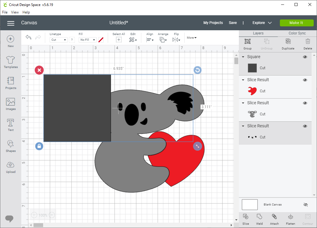
Select "Shapes" from the menu bar, then select "Square".
Position the square over one ear of the koala.

Select the square and the Slice Result containing the koala's features.
Select "Slice".
Select and delete the square.
Select and delete the extra koala inner ear.

Repeat for the second ear.

This will leave you with five layers instead of three. On the original 6.664" x 5" image, this will save about a 2" square of vinyl, about half of the black vinyl needed to cut the image already laid out. Vinyl savings will increase with a larger image size.

Color changed to yellow for visibility

VIII. 

Cut your image.
Remember to mirror iron-on vinyl (or conversely, don't mirror it and do a koala facing to the left). Weed all cut images.

IX. Applying vinyl

For the example image, iron on the koala first. Peel the carrier and keep it (we'll come back to it).
Position the facial features and inner ears. Place the carrier from the koala on top of the image before ironing on the eyes and inner ears.
Peel, retaining again the carrier from the koala.
Position the heart. Again cover the koala with its carrier before ironing on the last part of the image.

For a more complex image, you might want to make a copy of all the parts of the image, change it all to a single color, and cut out the copy in cardstock to use as a template.

Wednesday, October 30, 2019

Cricut Project: Samhain: Honoring Salem's Victims

Last year, I planned to create a "Hallowe'en" shirt that harkened back to the celebration's origins: the Celtic New Year and the thinning of the veil between the worlds. In other words, Samhain.

Living in the United States, it's hard to think of "witches" without thinking of the unjust and oppressive "trials" and executions of those Salem, Massachusetts residents accused of being witches. I decided I wanted a ragged, almost "bloody" Pentacle to symbolize that oppression and loss, words to honor acknowledge those who were accused, and an "honor roll" of those who became, depending on your view, either victims of public hysteria or martyrs for Pagans in the Americas.

My timing was off, and my design not completed until well after Samhain.


At September's Pirate-themed Geocaching MEGA event, I had a conversation with a board game vendor whose wares included AFFLICTION: Salem 1692, a board game centering around those very events. Our discussion inspired me to create the T-shirt I envisioned last year.


I used a slightly larger shirt than usual because the amount of text requires this shirt to be worn untucked. The large amount of text and the wide settings needed to make the text legible at a distance required me to piece those areas section by section, cutting them out with 24" mats.


I used almost two complete (36") rolls of Siser HTV in the (discontinued) color "Peach Fuzz", plus 12" of "Bright Red". Had I used Cricut brand HTV, the shorter roll length (19"-24", depending on color and style) would have probably required three or four rolls of the light color.

Not by any means an inexpensive project, but one I needed to do to honor those who were persecuted largely because they did not conform to their society's norms.

Monday, September 16, 2019

New! Cricut Classes at Michaels (Watchung, NJ)

After way too much hemming and hawwing, I came up with an idea for a new Cricut class which was approved for teaching!

This Sunday (September 22) and again on Thursday, October 3, I will be teaching Make Math Fun With Cricut. Aimed at educators and parents, I'll show you how to use your Cricut Explore series or Maker to create tools to help explain everything from basic shapes through some of the fundamentals of geometry. (Well, sadly, not algebra.) If you're interested, you can sign up here.

For those of you who haven't unboxed your Cricut, been overwhelmed by DesignSpace, or are deciding which Cricut to buy, I will be running a Cricut 101 class on Sunday, October 13. The link to that class is here.

The classes are all afternoon sessions, with both Make Math Fun classes starting at noon, and Cricut 101 starting at 1PM. (The classroom folk decide what time to make the classes; the Math class really needs to be run as an evening session so teachers can attend.)


Tuesday, August 20, 2019

Iron-On Heat Transfers and Smokey Bear

We're of that ilk of people for whom teddy bears are "real" (think: "Velveteen Rabbit" real), and so when we read that Smokey Bear was coming to town to celebrate his 75th birthday, and that there was geocaching involved, our geo-trackable teddy bears got all excited and wanted to do something to celebrate.

They've also been after me for t-shirts for the warm weather. (Donovan usually wears a hand-knit Christmas sweater after Thanksgiving, and a hand-knit Irish Fisherman Sweater most of the rest of the winter, while Lambie wears a hand-knit Maple Leaf sweater, celebrating his Canadian heritage (we found him at a gift shop in Halifax, Nova Scotia. Donovan started life as a Boyd's Bear with a renfaire mission, traveling with us from Renaissance Faire to Renaissance Faire, usually dressed in 1570s-era Spanish Court attire.)

The first Smokey 75th graphic I saw, attached to the Mid-Atlantic Forest Fire Compact's commemorative Smokey Bear GeoTour passport, was set against a night forest sky. A nice rectangle for something that would look like a "band" t-shirt, and since spokesbears like Smokey are the equivalent of rockstars to the teddy bear world, highly appropriate.


Not wanting to sew an entire pair of t-shirts from scratch, I found Lambie would reasonably fit the top half of a newborn-size onesie. I still would need to sew Donovan's shirt from scratch. Since I was using white fabric, I sized and printed the GeoTour logo on light-fabric iron-on. I also double checked my heat settings: the 400F cotton setting suggested for iron-on was hotter than my original Cricut EasyPress goes, so it was off to the regular iron. (Besides, these shirts were really too small for a heat press.)

Sadly, even with the higher temperature, the transfer looked incomplete and extremely washed out.


Additionally, Donovan's shirt was a bit tight, the neckline a bit feminine, and the sleeves too long.

Donovan (left) and Lambie in their original Smokey Bear T-shirts

So I recut Donovan's shirt, reprinted the graphics on dark-fabric iron-on, and went from there. Meanwhile, my sister's trackable bear Mink (and his sidekick Del Sol) needed to garb out as well. Mink is tiny enough that the best I could do for him was a singlet with a version of the official Smokey Bear 75th birthday logo. Del Sol, even smaller, could only manage a superhero-style cape. And so the bears were now ready to party with Smokey Bear.

The bears explore the photo props at Smokey's birthday party
Once we decided that we were going to celebrate Smokey's birthday at Liberty State Park, it occurred to me that we should get the people in the household involved in the t-shirt project, just like those families who do Disney parks in matching t-shirts. For this, we chose the official logo (following the proper logo guidelines) for the upper left corner of our shirts, with the geocachers' names on the back along with #SBGT for "Smokey Bear GeoTour". As a non cacher, I refer to myself as a "geo tag-along" and put that on the back of my shirt.


The official color Smokey 75 logo is meant to be produced only on a white or khaki background; all other color backgrounds require a single color white or black logo (logo guidelines here). Since the bears were going to be wearing white, we would wear white also, making it easy to use the color logo.

You may recall from a previous post that iron-on transfers require the "cotton" temperature setting, which is hotter than my original EasyPress will go; I therefore used a regular iron. I tested one of my spare light-color transfers using the iron's cotton setting, and found that even with the high heat setting and pressure, the transfers looked washed-out on a white T. While the white background of dark-fabric iron-on transfers would not necessarily show up on a white shirt, I find that the more superfluous iron-on kept in the transfer, the less flexible the stretchy t-shirt is, and the more like an "iron-on heat transfer t-shirt" it appears. (This is one issue I had with early Café Press products...)

Of course, I have a Cricut — which means I can use Print then Cut to perfectly (or near perfectly) trim the transfer! On the other hand, the Smokey 75 logo typeface has a distressed look with a lot of open spaces, and the logo itself has some open spaces as well. The third issue is trying to figure out the correct settings for cutting iron-on transfers.

Since there are two methods of uploading a complex graphic to Design Space, I found the key was to upload the image twice: once as the Print then Cut file I wanted to produce, and once as an outline Cut file. In both cases, I removed the white background. For simplicity's sake, I chose to not worry about cutting out the centers of my letters (which I would have needed to do if I were printing the logo for a khaki shirt).

Print then Cut, and Cut only, uploads

To prevent the program from cutting out all those micro-holes, I sized Cricut's basic shapes (mostly rectangles) to match the widths of my distressed letters, and welded them to the Cut-only graphic. After welding out all the tiny distressing holes, I aligned my cut image with my color image, moved my color image to the top, changed my Cut only image to white, and flattened the two layers. This gave me a color image with simplified cutouts (you can see the white that remains where the "5" meets the birthday balloon).

I changed my Design Space background to blue so you can see the effect:


While my images were small enough to fit two to a page, Design Space didn't want to set them up to cut that way. As a result, I needed to duplicate my logo, put the two copies side by side, and Attach them to save iron-on material. Unfortunately, this ended up with some stray cuts through my image. (Fortunately, nothing that couldn't be faked through with the appropriate use of HTV transfer tape... but I'm getting ahead of myself.)

Notice the centers of the "B", "R", "D", and "A" have not been weeded. A white circle behind Smokey was needed to avoid Design Space adding a cut line across the bottom of Smokey's face. The balloon string separated from the carrier paper and is curled up in the upper right of the image.
As you can see from my printed, cut, and weeded sample, my image has a number of separate elements which must be aligned correctly to produce the copyrighted image. As an image printed on opaque medium, the adhesive side is attached to the carrier sheet. I needed some sort of transfer tape to keep my elements aligned for heat transfer. Fortunately, I had purchased a yard of the stuff from Ante Up Graphics, from whom I purchased my "Infinite Galaxy" Siser EasyPatterns® back in June. It's called "Siser TTD High Tack Mask", and it's used pretty much the same way transfer tape is used for adhesive vinyl projects.

Using the TTD High Tack Mask is not without its own issues. Like the carrier for normal HTV, the material is not as impervious to heat-press temperatures as I'd like it to be: it warped for almost every project I've tried it on, occasionally releasing an improperly-adhered (or non-adhered) design element, and iron-on ink sticks to it and comes off on the next project.

In the end, all of our Smokey Bear 75 garb was a hit, and the three people had as much fun as the four teddy bears did geocaching and chasing down Smokey for pictures.

Smaller 75 logo on Lambie's sleeve

Donovan and Lambie look for a geocache
More Geocaching

The bears meet Sparky the Fire Dog

Me, Smokey, and the Teddy Bears