Wednesday, January 9, 2019

Working With Vinyl Scraps

One of the downsides of large T-shirt designs such as "Hippopotamus for Christmas" and "Dreidel for Dummies" is the amount of heat-transfer vinyl (iron-on, HTV) that they use. Not counting the costs for licensing Cricut Access images, the hippo T would have cost me $30 in materials; the dreidel T, $20, had I not been working at Michaels and been able to use Associate discounts on top of sale prices. I'm not counting design time or application time, and I've saved a significant amount of vinyl on the hippo by delayering the images. This would put the retail price of a vinyl T somewhere in the $30-40 range, even for a $2-on-sale craft T-shirt. (The blanks Cricut associates use on their instruction videos run $10-15 on sale at places like Target and Old Navy, making a more "designer" look that much more expensive!)

My colleague S. would have loved a hippo T, but the materials costs alone would be out of budget for her. I found a cute Snowman T-shirt pattern on Design Space that could be made cheaply from scrap vinyl — with a few tweaks to the pattern.

When I looked at the mats, I noticed all the little black dots for the snowman's eyes and mouth were attached, as well as the white dots for the reflections in the snowman's eyes. That ends up creating a lot of wasted vinyl. I also noticed that there was no way to register the cut so one knew exactly where to place the orange nose.


Since Design Space doesn't have a good way of setting registration marks, I decided to create a paper template.

First, I attached all of the design elements into a single cut image and resized it to an appropriate size for the T-shirt. Attaching elements turns them all the same color, but it's easy enough to turn them back later.)


I used this monochrome to cut my paper template. Instead of weeding the background, I weeded out the design elements to produce a template with openings for each of my vinyl cuts. While the weeding isn't perfect, it's sufficient for my purpose.


Next, I detached all of the design elements and returned them to their proper colors. I also delayered the inner eye, so I would only have one layer of vinyl throughout the shirt.


You'll notice these use a lot less vinyl if cut from a fresh roll. Each piece can be moved individually, so they can be positioned to use waste vinyl, either manually (in the Web app) or by using the Snap Mat feature on an iPad. I used scrap vinyl from "Dreidel for Dummies" and "Baby, It's Cold Outside" for my white and black, and the rest of a "row" of rolled vinyl for my orange.


My final cost: about $6, if I include the vinyl as rolling inches.

Needless to say, S. was surprised and delighted.

Tuesday, January 8, 2019

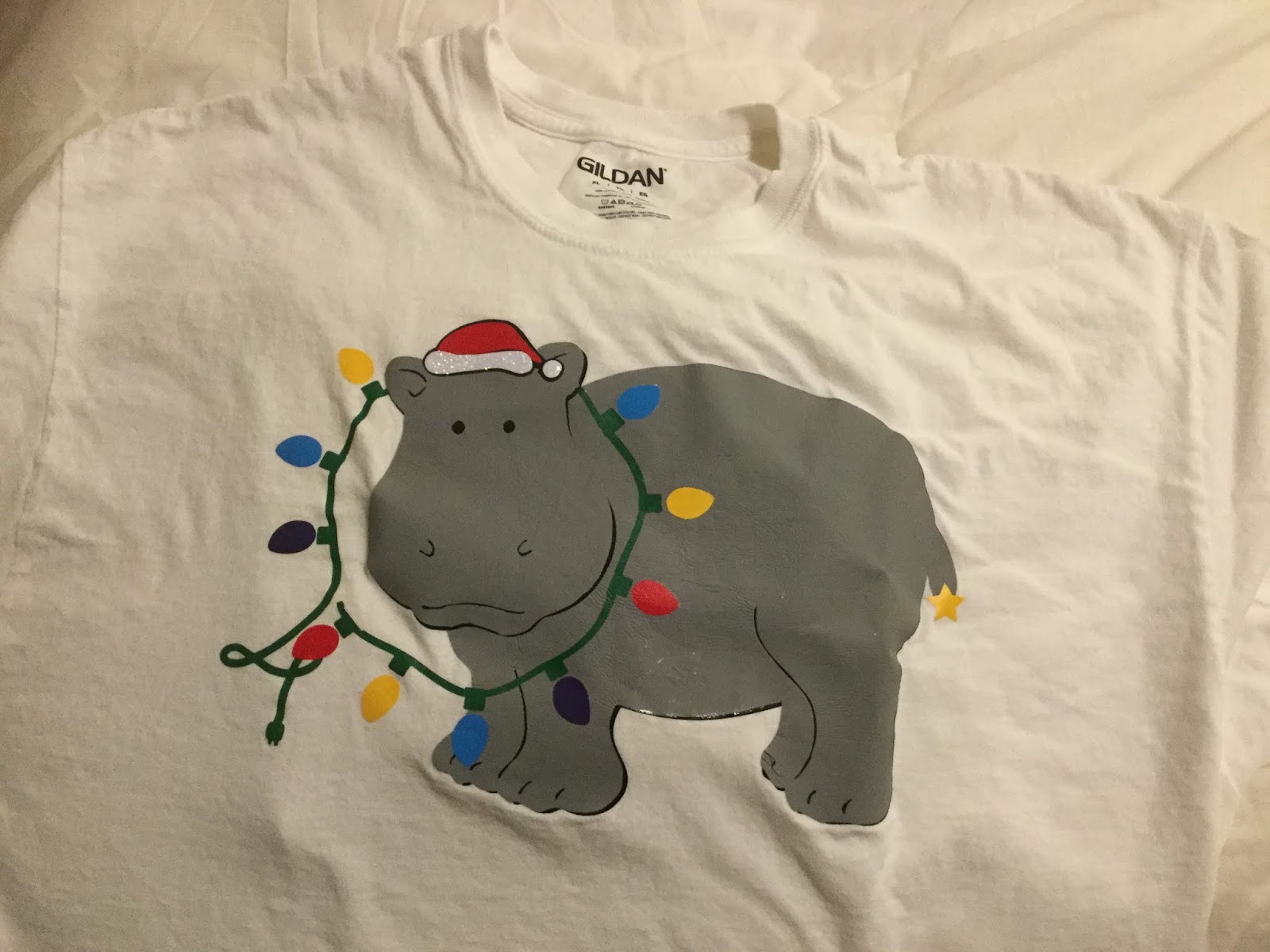
I Want a Hippopotamus for Christmas

Last year, the overwhelming "stop playing this, already" Christmas song was Elvis's "Blue Christmas", leading me to do a pair of multiprocess blue T-shirts including the ghosts of Elvis, and on one version, (Bob) Marley's ghost. ("The obligatory Dickensian reference.") This year, I must have heard "I Want a Hippopotamus for Christmas" a dozen times between Thanksgiving Day and the following Monday. So when my sister decided she needed some new Christmas T's for a competition at work, hippos were still on our mind...

Since I'm not much of an artist, I searched Cricut Access for images of hippos. To make the friendly-looking beast (Cricut Access image M2E803Christmas-y, I added a Santa Hat (Cricut Access image M188702D) and a string of lights (Cricut Access image M8AE3A8A) to the composition. Having all the elements I needed, I had to combine them into an image that made sense.

I removed the grayscale hat, moved the red hat and changed its angle to sit on my hippo's head. Then I had to see about moving the lights so it looked like they were being worn as a necklace. Fortunately, the hippo image is a group of layers, some of which include a separate head.


I ungrouped the hippo and moved the two head-only images in front of the lights. I then turned on the narrower of the black underlayers so we could see the hippo's black eyes.


It was about this point that I ran my first paper prototype and found that the slices that give form to the hippo's legs, toes, nostrils, ears, and mouth are just single cuts which would disappear in an iron-on. At that point I hid everything but the hippopotamus, screen-captured my Design Space screen, brought it up in Paint, thickened the lines in question, and saved it out as an image to import back into Design Space. I used the original image and the Slice function to separate the better-defined hippo into head and body sections.

The other thing I realized is that half the lights are digging into the hippo's neck. I used squares, the Slice function and the Weld function to turn the light sockets around so
they all faced out, and rotated the lights as necessary.


At this point, the folk at Cricut would have you think the design was ready to go...

Not so fast!

With all of the layers involved, the finished T-shirt would be very thick and inflexible. I needed to turn off everything I didn't need in the finished shirt, and once I cut everything, trim things back to minimize the amount of layering needed. (That meant cutting the head off the black version of the entire hippo, because it was only duplicating the black head that would lay over the string of lights.) I also detached all of the lights so they would use a lot less vinyl; I could position them by hand.

After weeding, I placed everything in layers in some semblance of registration so I knew which layers had to go on the shirt in what order. I printed out a screenshot of my Design Space design so I knew how it all had to go together. Then I took it all to work so I could use our classroom's Easy Press to put everything together.


According to my sister, the shirt was a hit!


Tagged by Cricut!

The typical Chanukah version of the "Ugly Christmas Sweater" includes a chanukiah (9-branched menorah), a Star of David, and/or a dreidel (4-sided top with Hebrew letters on each side). It is some combination of a near royal blue and white, echoing the colors of the Israeli flag (which in turn, echo the colors of a traditional tallith or prayer shawl, which themselves echo the Biblical command to wear a garment with fringes, and in each corner, a thread of a particular shade of blue — Num. XV:37-41). Gold, silver, or their equivalent tones of yellow and gray, may be added for contrast.

Let's just say I'm not typical. (Would a typical person wish you a "Boo Christmas"?)

While the game of dreidel is quite simple, it seems difficult to explain to someone for the first time. This is particularly true because the letters on the dreidel are generally written in Hebrew "print", and to a non-Hebrew reader, the nun (נ) can look very similar to the gimmel (ג). I decided to have some fun and print up a T-shirt with an irreverent set of instructions, and presented in the manner of Wiley Publishing's "For Dummies" series of books and e-books. I licensed a couple of dreidel images from Cricut (#M3BA72 and #M87F31EA), and because I didn't have the same typefaces as Wiley uses for their series (and hey, I didn't want to copy their cover page design exactly because that would be copyright infringement!), I used dafont's Kanisah Regular (for the word "Dreidel") and the installed version of Papyrus ("for Dummies") on the back, Google Fonts' Alegreya Sans Italic for the title on the front, and Arial Bold for the instructions themselves.


It was a fun project and basic enough to "share" on Design Space. Little did I know that Provo Crafts' blog authors thought it worthy of highlighting!

I was looking for Judaic-themed shirts recently, just to see what was around and get some ideas for what sells at what price points, and one of the links Google found was my "Dreidel for Dummies" in Cricut's "Holiday T-Shirt" blog.

I wish I'd found out about it earlier, but hey! Thanks, Cricut!


Monday, October 22, 2018

Font Frustration

Some of my more recent posts have been about creating Design Space-compatible designs using Hebrew (and Yiddish) words and lettering on the computer. Using my computer and Adobe Creative Suite to create in a non-Western character set has been a bit of a learning curve (and a bit of a pain even after that learning curve has been mastered), but it's doing the job as long as I'm at home and using full sheets of cuttable materials.

The problem is, I need to be able to edit, design, and prototype on the road — and for that, I need to be able to create in Hebrew and Yiddish from my iPad. Design Space doesn't like it when you don't have the same typefaces loaded on all your devices, and either refuses to open a project or replaces your custom typefaces with something stupid like Arial or Cricut Sans. So, I needed to load my Hebrew typefaces onto my iPad.

To add fonts to the iPad, you need to download a font manager app (such as iFont), and you need to know how to get to a directory into which you will store (or have stored) your fonts. (Mine are stored on my OneDrive, which is accessible from most of my iPad apps.) The process is a bit tedious as you have to download the file to your font manager, click on the file in the Font create a new System Profile for each typeface, even though you're not using the new typeface as your system font (the generic typeface that shows up in all your menus, folder names, instruction sets, etc). I downloaded a large portion of the typefaces available through the Open Siddur Project as well as a number of free Google Fonts. I also enabled Hebrew language editing on Swype and Apple Keyboard, and downloaded even another Hebrew-friendly keyboard.

Finally, I opened Design Space and attempted to load a project which included Hebrew text. I got a "missing fonts" error, even though I had the same typeface loaded on my iPad as I did on my PC. When the project loaded, Hebrew type was replaced by large rectangles with Flintstones-looking question-marks inside them. I tried editing the text, but the editor refused to let me do anything other than open a new text box. I chose a Hebrew-containing typeface and typed in Hebrew. Despite entering text right-to-left in the text box, Design Space rendered it left-to-right, another batch of Flintstones question marks. I tried another typeface, and got Eastern European codepage characters. No matter what I tried, I could not accurately enter a single Hebrew or Yiddish character in Design Space for iOS.


I went back and forth with Cricut user support on this. Their stance on the matter was "Design Space only supports the English language", and that the language-support blurb in the App Store meant only "that the app will show up as available if in the countries where that language is common".


Sorry, that answer is confusing at best — but I don't know if that error is Apple's or Cricut's. Meanwhile, the best I could do was get a tech to pass on the request to the development team. And relegate my non-English design development to Windows.


Creating an Alphabet - Ingress into Niantic's Glyphs

I'm not into geolocation games, but my housemates are. My Other Half is a recreational geocacher, has been active with Munzee, and is somewhere up in the difficult-to-reach levels of Ingress. My sister is a virtual Ingress addict. (Both play with the "Resistance" faction.)

As a non-participating tag-along to several events, I've finally decided I needed an appropriate T-shirt. I have a couple of designs ready to go for a "Geo Tag-Along" shirt.


My other geolocation design work has been firmly in the Ingress realm: a Resistance glyph (which looks like a number 4 with a tail) for the Other Half's car, along with a Resistance pocket polo that has the Resistance "key" logo. (The design is not shared on Design Space because the graphic I used is not mine, so I'm restricting the design to personal use.)

Playing around with Cricut's typefaces, "All Mixed Up" reminded me a lot of the calibration grid for Ingress's glyphs.
Cricut Typeface "All Mixed Up" copyright Provo Crafts International.
 I decided to try my hand at doing a multilayer alphabet based on that callibration grid.

The work required figuring the placement of the pips (holes), creating a complex path in Illustrator, then creating and inserting the line elements. Finally, the whole thing had to be imported into Design Space, where I welded the paths of the line segments and ditched the extraneous ones I used for editing.


Ingress Alphabet (.svg)

My character set is limited to unaccented Western letters, numerals, and a couple of marks one might expect to see in player names. I chose orange as a neutral working color. (Resistance players will be able to color the lines blue, while Enlightened players can change it to green.) Each letter and background is grouped, and will need to be ungrouped before changing colors. The current design does not have a white background, so you might need to add that as well.

Ingress players will notice a couple of things besides the weird orange color: some of the characters are identical to glyphs seen in the Glyphtionary. I've been able to change two from my original design, but my "I", "V", and asterisk still duplicate official Glyphs.

The Glyphs themselves are also available as cut files on my Cricut profile.